INDIA,

INDIA,

11:13:23

11:13:23

A burger wrapped in red paper printed with a hand-drawn "ATMO SPHERE" lettering that includes a fork, spoon, raised hand and phone, over a large pink wordmark pattern.

Atmosphere 

Atmosphere 

Client :

Mr. Neil

Year :

2025

Tags :

Brand Identity
Packaging Design

Food & Drink

Atmosphere is a café and food hall that brings several food experiences under one roof, from coffee corners to a mix of eateries. We developed its brand strategy, brand identity and packaging design: a rounded custom wordmark with food icons built into the letters, a bold red and cream palette, and the line “Eat. Vibe. Repeat.” The identity carries through cups, bags, uniforms, burger wrappers and outdoor advertising.
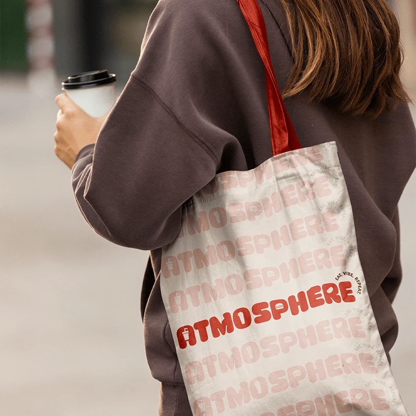
A cream tote bag with a red strap, printed with rows of pink "ATMOSPHERE" wordmarks and one in red, carried by a woman in a brown sweatshirt holding a coffee.
A hand holding up a cream takeaway cup with a red lid, printed with the stacked red "ATMO SPHERE" wordmark and "Eat. Vibe. Repeat."
The cream "ATMOSPHERE" wordmark with the curved line "Eat. Vibe. Repeat." on red crumpled paper.

Atmosphere is a café built around more than one kind of food. It needed a brand identity that could hold coffee, burgers and a lively social space together, and still be remembered as one place.

Atmosphere is a café built around more than one kind of food. It needed a brand identity that could hold coffee, burgers and a lively social space together, and still be remembered as one place.

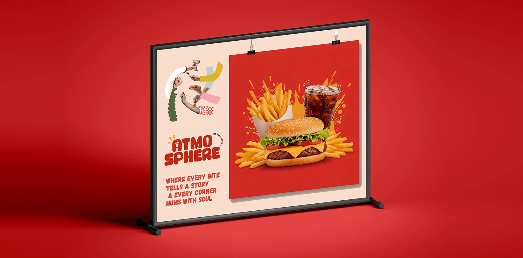
A framed poster stand on red showing a hand-drawn collage of hands holding food, the stacked wordmark, the line "Where every bite tells a story & every corner hums with soul" and a clipped photo of a burger, fries and cola.

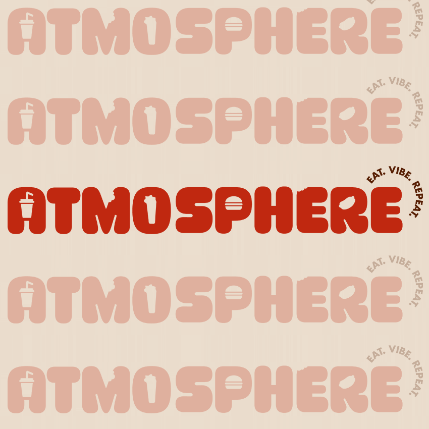
The Atmosphere wordmark is built from rounded, open letters with food-themed icons worked into them. Cream on red, with the line “Eat. Vibe. Repeat.” curved beside it, it looks like the place feels: warm, lively and welcoming.

The Atmosphere wordmark is built from rounded, open letters with food-themed icons worked into them. Cream on red, with the line “Eat. Vibe. Repeat.” curved beside it, it looks like the place feels: warm, lively and welcoming.

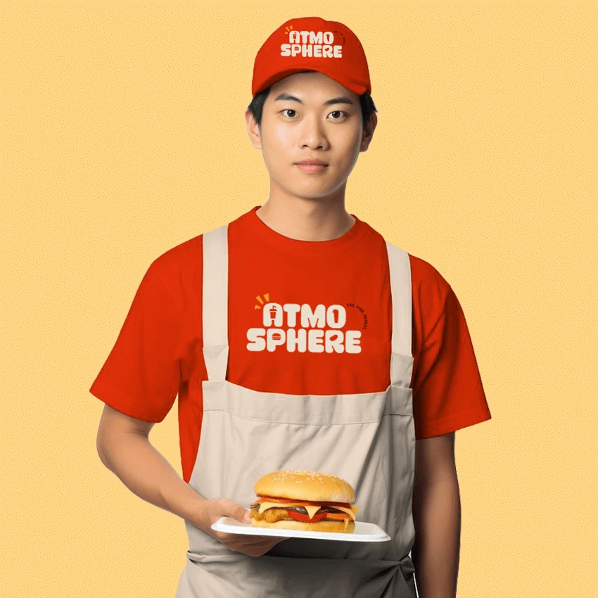
A staff member on a yellow background in a red cap and T-shirt printed with the stacked wordmark and a beige apron, holding a burger on a plate.
Five rows of the "ATMOSPHERE" wordmark on cream, the middle one in red with "Eat. Vibe. Repeat." and the rest in faded pink.
A large red roadside billboard among trees showing the cream "ATMOSPHERE" wordmark, with a drink cup, burger and bitten letters, over a tonal fast-food icon pattern and the curved line "Eat. Vibe. Repeat."

Atmosphere is a café and food hall that brings multiple food experiences together under one roof, from coffee corners to diverse eateries. We developed its brand strategy, brand identity and packaging design.
The challenge was to give a place with many offerings one memorable brand, and to make dining feel like an experience. Discovery covered research, interviews and the definition of user groups, and the design work followed from it.
The result is a rounded custom wordmark with food icons built into the letters, a red and cream palette and the line “Eat. Vibe. Repeat.”, applied across cups, tote bags, burger wrappers, staff uniforms and outdoor posters.

Visual Identity,

Packaging Design,

Social Media Design

Sidharth

Sidharth

Say hi,

hello@slsh.studio

Leave with a mark

Slash across the folded sheet. Every cut repeats eight times when it opens.