INDIA,

INDIA,

11:13:24

11:13:24

A teal gable-top takeaway box printed "Wholesome Regional Indian." and "TERRACURRY", sealed with a holographic wordmark sticker and held under an arm.

Terracurry

Creative Direction, Brand Identity, Web Design

Terra Curry is a brand built on the belief that good food should leave you feeling good, not weighed down. It makes regional Indian comfort food feel nourishing, contemporary and full of character, from visual identity to website, without losing its roots.

Six men in linen shirts and sunglasses pose on a sunlit veranda with a carved sofa and wicker loungers, under "MITESH LODHA".

Mitesh Lodha

Brand Strategy, Brand Identity

Mitesh Lodha is a Mumbai menswear house built on made-to-measure tailoring. Its three labels cover handfinished formal suits, an everyday contemporary wardrobe, and Indian design in kurtas, sherwanis and bundis.

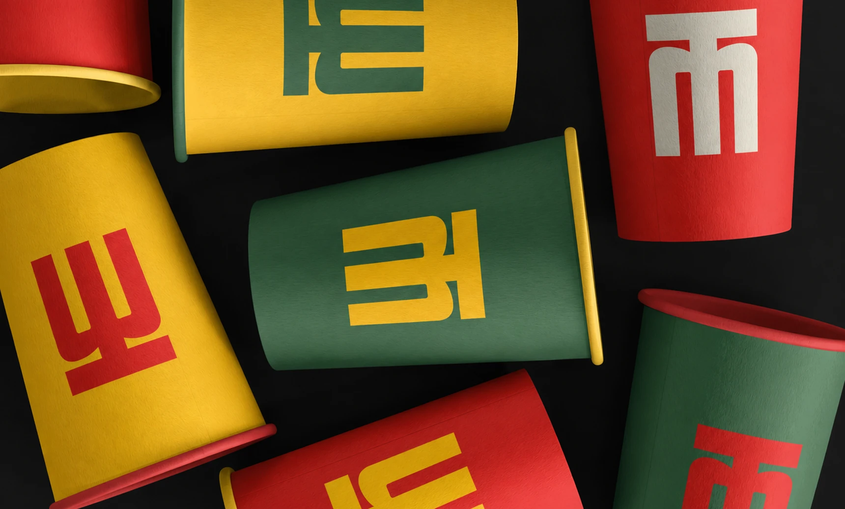
Scattered red, yellow and green paper cups on black, each printed with part of the Mangaluru Canteen monogram.

Mangaluru Canteen

Creative Direction, Brand Identity, Collateral Design

Mangaluru Canteen is a Pune-based South Indian restaurant bringing the food, familiarity and visual character of Mangaluru to a new city. Its identity needed to feel rooted in its origins without seeming dated or overly traditional.

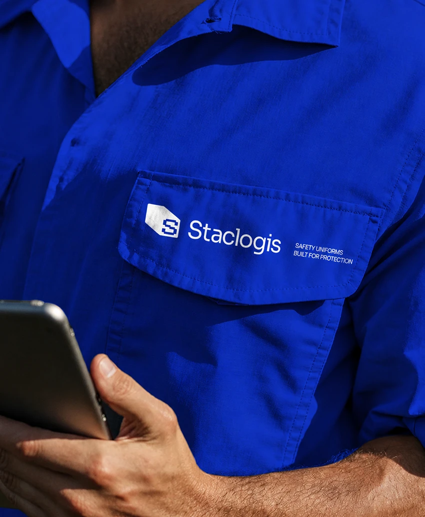
Close-up of a worker in a blue Staclogis uniform shirt with the white logo on the pocket, holding a tablet.

Staclogis

Creative Direction, Brand Identity, Collateral Design

Staclogis is a Chennai-based industrial and logistics infrastructure company building scalable warehousing, storage and integrated logistics ecosystems. Its identity needed to feel structured, substantial and capable of operating at scale.

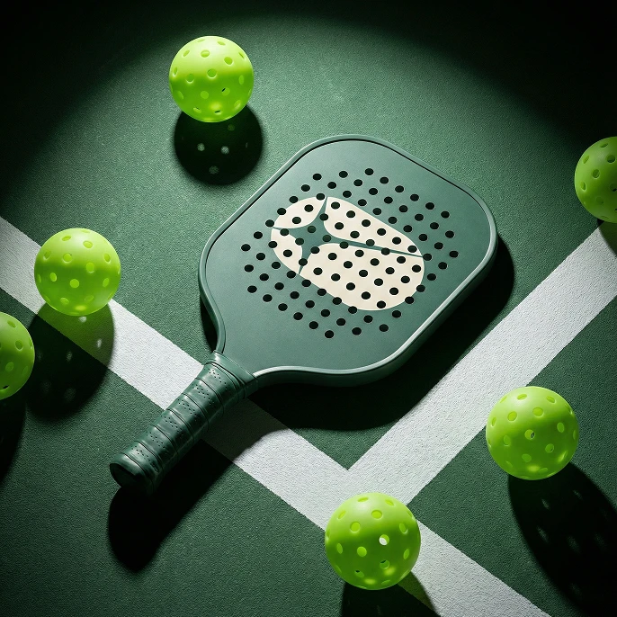
A forest green pickleball paddle with the sand Action Replay icon, lying on a green court among lime pickleballs.

Action Replay

Creative Direction, Brand Identity, Collateral Design

Action Replay is a sports capture company preserving the fleeting moments of racket sports. From match point to the diving save, it documents raw, unfiltered emotion before those split seconds disappear.

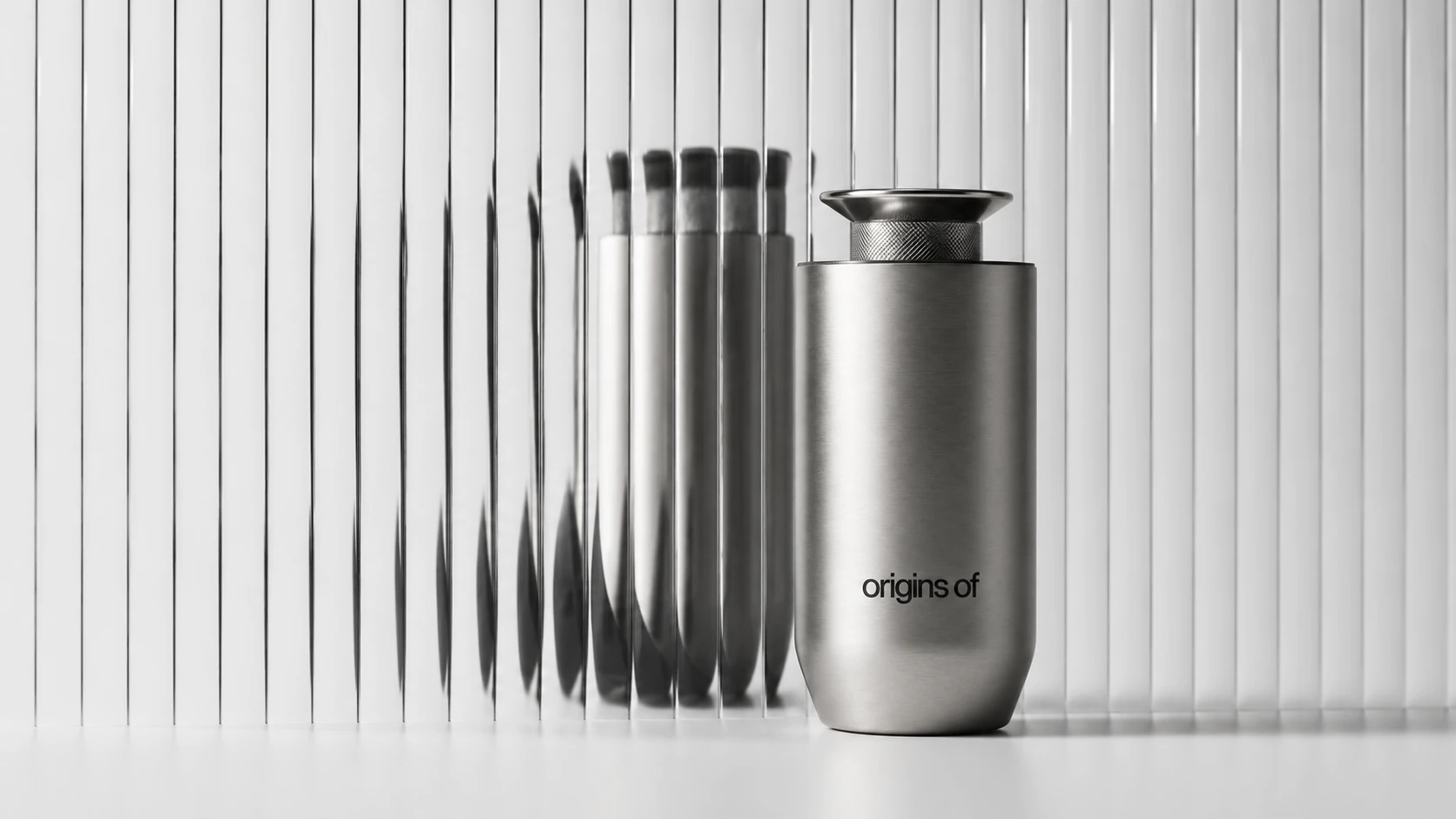
A brushed-steel Origins Of waterless diffuser with a knurled top standing on a white surface, its reflection repeated and distorted behind a pane of fluted glass.

Origins of

Creative Direction, Brand Identity, E-Commerce

Scent is the sense most tightly bound to memory, yet home fragrance is priced and designed like a commodity. Origins Of was built on the opposite premise: that what a room smells like is worth engineering.

A teal gable-top takeaway box printed "Wholesome Regional Indian." and "TERRACURRY", sealed with a holographic wordmark sticker and held under an arm.

Terracurry

Creative Direction, Brand Identity, Web Design

Terra Curry is a brand built on the belief that good food should leave you feeling good, not weighed down. It makes regional Indian comfort food feel nourishing, contemporary and full of character, from visual identity to website, without losing its roots.

A hand carrying a metallic silver PEAQ shopping bag with violet handles and a violet gradient wordmark.

Peaq

Creative Direction, Packaging Design

PEAQ is a peptide brand, and this project covers its packaging: vial, label, supplement facts panel, metal containers and retail bag. The direction treats peptide packaging like precision equipment, with cool metallic surfaces, exact forms and bright gradients on a dark base.

Six men in linen shirts and sunglasses pose on a sunlit veranda with a carved sofa and wicker loungers, under "MITESH LODHA".

Mitesh Lodha

Creative Direction, Packaging Design

Mitesh Lodha is a Mumbai menswear house built on made-to-measure tailoring. Its three labels cover handfinished formal suits, an everyday contemporary wardrobe, and Indian design in kurtas, sherwanis and bundis.

Close-up of a worker in a blue Staclogis uniform shirt with the white logo on the pocket, holding a tablet.

Staclogis

Creative Direction, Brand Identity, Collateral Design

Staclogis is a Chennai-based industrial and logistics infrastructure company building scalable warehousing, storage and integrated logistics ecosystems. Its identity needed to feel structured, substantial and capable of operating at scale.

Scattered red, yellow and green paper cups on black, each printed with part of the Mangaluru Canteen monogram.

Mangaluru Canteen

Creative Direction, Brand Identity, Collateral Design

Mangaluru Canteen is a Pune-based South Indian restaurant bringing the food, familiarity and visual character of Mangaluru to a new city. Its identity needed to feel rooted in its origins without seeming dated or overly traditional.

A forest green pickleball paddle with the sand Action Replay icon, lying on a green court among lime pickleballs.

Action Replay

Creative Direction, Brand Identity, Collateral Design

Action Replay is a sports capture company preserving the fleeting moments of racket sports. From match point to the diving save, it documents raw, unfiltered emotion before those split seconds disappear.

A brushed-steel Origins Of waterless diffuser with a knurled top standing on a white surface, its reflection repeated and distorted behind a pane of fluted glass.

Origins of

Creative Direction, Brand Identity, E-Commerce

Scent is the sense most tightly bound to memory, yet home fragrance is priced and designed like a commodity. Origins Of was built on the opposite premise: that what a room smells like is worth engineering.

The six above are where we’d start.

Here’s everything else we’ve made along the way.

The six above are where we’d start. Here’s everything else we’ve made along the way.

PeaqPackaging for a peptide brand, designed with the precisionCreative, Design, Packaging Design2026Object 754Architecture, interior and furniture design from Bangalore, crafted with detail.Brand Identity, Collateral Design2026Hefty Future HomesSustainable construction, from homes to large-scale infrastructureBrand Identity, Collateral Design2025BocconeFresh quick-serve comfort food, from fries to burgersCreative Direction, Brand Identity2025Rico RollsWraps, rolls and specialty coffee for Kochi’s everyday cravingsBrand Identity, Packaging Design2025Gradure AdmissionGuiding students from graduation to what comes nextBrand Identity, Collateral Design2025AtmosphereCoffee corners and eateries gathered under one roofBrand Identity, Packaging Design2025

Say hi,

hello@slsh.studio

Leave with a mark

Slash across the folded sheet. Every cut repeats eight times when it opens.