INDIA,

INDIA,

11:13:23

11:13:23

Branding

Most projects start with : who the brand is and how it sounds. From there we build a , write it down as , and carry it onto and, for restaurants and cafés, .

Most projects start with : who the brand is and how it sounds. From there we build a , write it down as , and carry it onto and, for restaurants and cafés, .

Most projects start with : who the brand is and how it sounds. From there we build a , write it down as , and carry it onto and, for restaurants and cafés, .

  • Timeline2–3 weeks

    Includes

    • Logo suite: logo, monogram and wordmark
    • Basic colour system
    • Basic typography system
    • Business card
    • One basic collateral
    • Social media kit: profile + 3 posts
    • Mockups
    • Brand guidelines
    Enquire about StartUp
  • Timeline3–5 weeks

    • Tone of voice
    • Target audience
    • Messaging pillars
    • Creative direction and visual concept
    • Extended logo suite: logo, monogram and wordmark
    • Logo variations
    • Extended brand colour system
    • Extended typography system
    • Custom brand elements: patterns and graphics
    • Business card
    • One collateral or packaging for 1 product (SKU)
    • Social media system: profile + 3 posts + highlight covers
    • Extended mockups and applications
    • Comprehensive brand guidelines
    Enquire about Growth
  • Timeline6–8 weeks

    • Market research
    • Competitor analysis
    • Brand gap analysis
    • Customer personas
    • Brand positioning
    • Brand personality
    • Tone of voice
    • Messaging pillars
    • Campaign ideas
    • Target audience (ICP)
    • Extended logo suite: logo, monogram and wordmark
    • Logo variations
    • Extended brand colour system
    • Extended typography system
    • Custom brand elements: patterns and graphics
    • Business card
    • Three collaterals or packaging for 3 products (SKUs)
    • Social media system: profile + 6 posts + highlight covers
    • Extended mockups and applications
    • Comprehensive brand guidelines
    Enquire about Signature

Also available

Packaging design, label design, menu design, interior and spatial branding, signage, stationery and print, social media posts, illustration. Priced on request.

[Recent Works]

A teal gable-top takeaway box printed "Wholesome Regional Indian." and "TERRACURRY", sealed with a holographic wordmark sticker and held under an arm.

Terracurry

Creative Direction, Brand Identity, Web Design

Terra Curry is a brand built on the belief that good food should leave you feeling good, not weighed down. It makes regional Indian comfort food feel nourishing, contemporary and full of character, from visual identity to website, without losing its roots.

A hand carrying a metallic silver PEAQ shopping bag with violet handles and a violet gradient wordmark.

Peaq

Creative Direction, Packaging Design

PEAQ is a peptide brand, and this project covers its packaging: vial, label, supplement facts panel, metal containers and retail bag. The direction treats peptide packaging like precision equipment, with cool metallic surfaces, exact forms and bright gradients on a dark base.

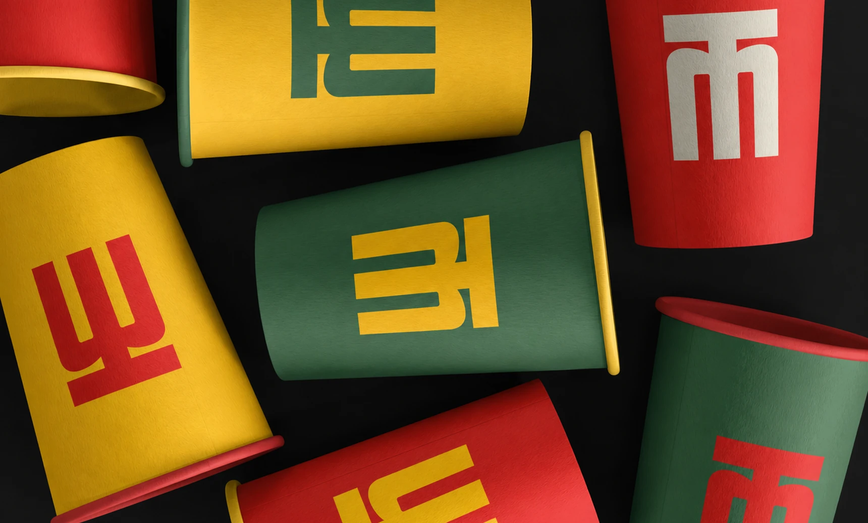
Scattered red, yellow and green paper cups on black, each printed with part of the Mangaluru Canteen monogram.

Mangaluru Canteen

Creative Direction, Brand Identity, Collateral Design

Mangaluru Canteen is a Pune-based South Indian restaurant bringing the food, familiarity and visual character of Mangaluru to a new city. Its identity needed to feel rooted in its origins without seeming dated or overly traditional.

Web Design

We design every page first, then build it as a your team can edit without a developer, or a you can run on your own. When a project needs more than either, we do a .

  • Timeline2–3 weeks

    Includes

    • Store designHome, collection, product, cart
    • Responsive layoutsMobile, tablet, desktop
    • Theme setupCustomised to your brand
    • Products and collectionsSet up for you
    • Payments, shipping, taxConfigured
    • SEO basicsTitles, descriptions, URLs
    • Launch and handoverDomain, go-live, walkthrough
    Enquire about Shopify
  • Timeline3–5 weeks

    Includes

    • Custom designNo templates
    • MotionTransitions, scroll, hover
    • Custom interactionOne, e.g. 3D or WebGL
    • Responsive buildTuned for every screen
    • CMSProjects, case studies or blog
    • SEO and speedTitles, previews, fast pages
    • Launch and handoverDomain, go-live, walkthrough
    Enquire about Framer

[Recent Works]

The dotminimal architecture studio homepage, with the line "Connecting the dots to unfold a story of design" and a "Works" row of interior photos, floating over a greyed-out photo of people carrying a red patterned rug.

Dotminimal

Web Design, Framer Site

Dotminimal is a Bengaluru-based architecture and planning studio practising minimalist, context-driven design. Its work balances function, form and meaningful spatial experiences, spanning architecture, interiors and installations, with a belief in essential, not excessive, design.

The Origins Of product page for the "Zesty Elegance" diffuser at ₹7,999, with four photos of the brushed-steel diffuser, size options and an Add to Cart button, over a blurred bronze background.

Origins of

Creative Direction, Brand Identity, E-Commerce

Scent is the sense most tightly bound to memory, yet home fragrance is priced and designed like a commodity. Origins Of was built on the opposite premise: that what a room smells like is worth engineering.

The TerraCurry website hero, "Wholesome Regional Indian that loves you back.", with tumbling cream and mint letters, floating over a darkened photo of hands holding a stacked TerraBowl.

Terracurry

Creative Direction, Brand Identity, Web Design

Terra Curry is a brand built on the belief that good food should leave you feeling good, not weighed down. It makes regional Indian comfort food feel nourishing, contemporary and full of character, from visual identity to website, without losing its roots.

Say hi,

hello@slsh.studio

Leave with a mark

Slash across the folded sheet. Every cut repeats eight times when it opens.