INDIA,
INDIA,
11:13:23
11:13:23
Boccone
Boccone
Client :
Mr. Aswin Kuriakose
Year :
2025
Tags :
Creative Direction
Brand Identity
Packaging Design
Food & Drink
Boccone is a fresh quick-serve food brand serving comfort food with personality, from fries to burgers and quick bites. We developed its brand strategy, brand identity and packaging design: a warm, rounded wordmark, a friendly chef mascot, a palette of mustard and deep green, and a wrapper and takeaway box system built for speed. The result is a quick-service restaurant brand that is easy to recognize on a counter, in a delivery bag and on social media.


Boccone wanted to stand out in a crowded fast-casual market without losing its approachability. The food had personality, and the visual language needed to catch up.
Boccone came to us with a simple goal: stand out in a crowded fast-casual market and stay approachable. Its product is comfort food with personality, with fries, quick bites and a mascot concept people remember. The visual side was less settled. The brand needed clearer marks, a dependable palette and packaging that works at takeaway speed.
Our strategy was to be bold where it counts and warm where it matters. It rested on three pillars: readability in motion, warmth led by character, and packaging systems that speed up service. Those pillars shaped the palette rules, how the mascot is used and the label system.
We locked those decisions early. The brand had shown inconsistencies before, with marks, colours and layouts changing from one touchpoint to the next. Fixing the rules at the start kept the restaurant branding consistent from the first design to the last.

The Boccone wordmark has warm, rounded letterforms and a small friendly bump on the ‘o’, a nod to the mascot’s cheeky personality. The mascot is a humanised snack in a chef’s hat, and it sits in front of a repeating pattern made from the wordmark.
A fast-casual restaurant logo has to look friendly and read quickly. The Boccone wordmark is built from warm, rounded letterforms, with a subtle bump on the ‘o’ that echoes the mascot’s cheeky personality. That small detail ties the name to the character without adding a symbol. The wordmark works in more than one colour: mustard on black, white over food photography, and tone on tone as a repeating pattern.
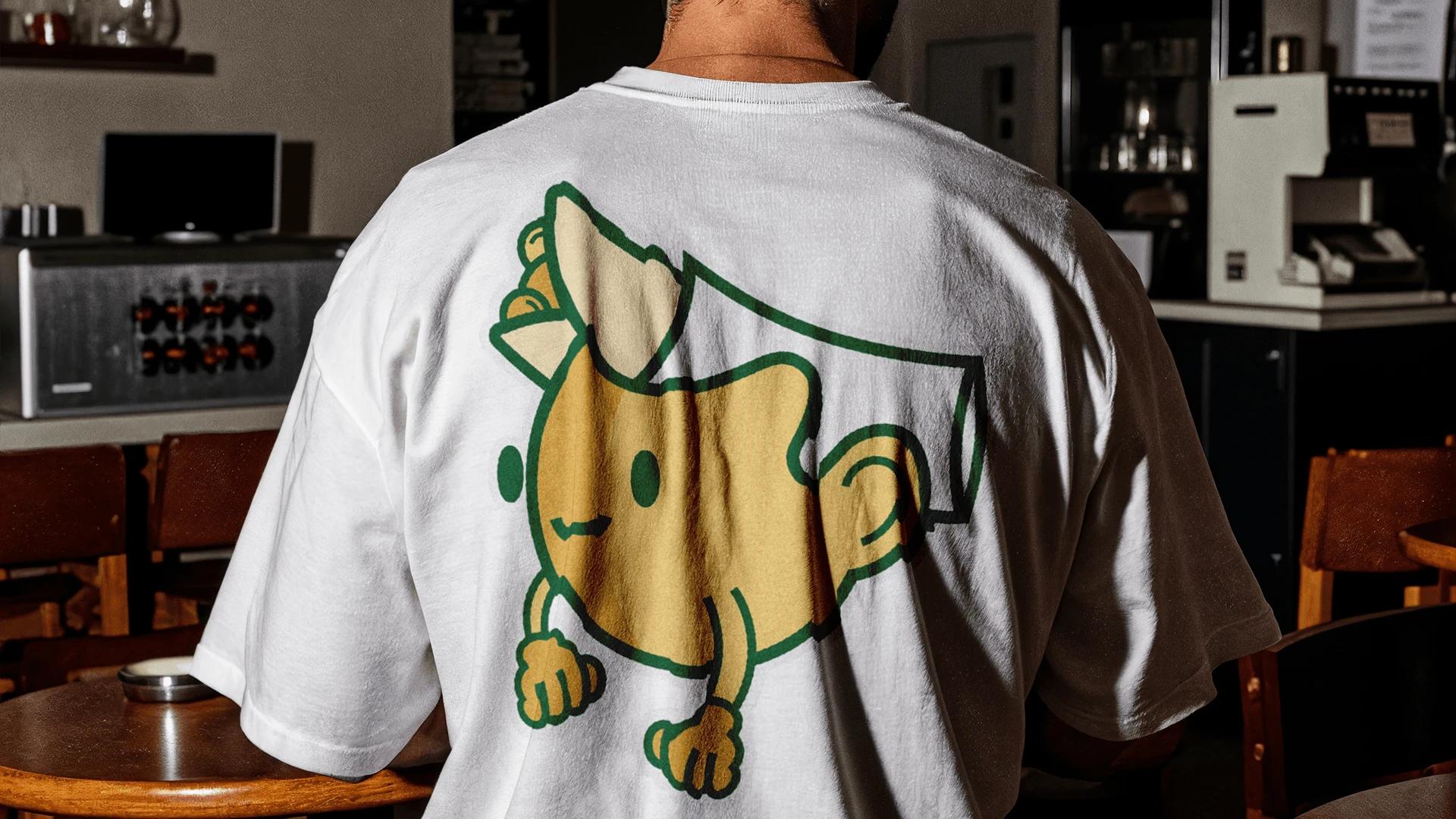
The mascot is a simple, humanised snack with chef elements, shown in a chef’s hat and holding a fork. It plays a secondary role in the identity. At large scale it sits in front of the repeated wordmark pattern, so the name is always present behind the character, and the same device runs quietly behind headlines. We kept the mascot away from functional touchpoints like menus and wayfinding so it never crowds information.
That split is what makes a mascot useful in food brand identity. The wordmark carries recognition, and the character adds charm and gives the brand something people remember and enjoy.


The palette is warm mustard, deep green and a neutral. Menus put contrast and speed first, signage uses the main accent for calls to action, and staff kit keeps the mascot to a minimum.
The primary palette is built on three colours: warm mustard, deep green and a supporting neutral. It is earthy and appetite-friendly, and it suits both food photography and retail fixtures. Materials follow the same approach, with slightly textured uncoated stocks and matte finishes that keep packaging tactile and food images warm. Merchandise and staff kit use flat inks, which keeps the colour consistent and the print durable.
Menus are designed for contrast and speed, with large headlines, short descriptions and a clear price hierarchy. A customer in a queue can find what they want and what it costs in seconds. Signage and wayfinding use the main accent colour for calls to action, and the neutrals hold descriptions and smaller copy. Staff kit keeps the mascot presence light, friendly without being distracting.
The identity also works outside the restaurant, in lightboxes, wayfinding and merchandise, such as a white T-shirt with a large mascot print on the back. In each case it stays legible even when seen in passing.


The packaging was designed to feel as good as the food. Wrappers, liners, cups and takeaway boxes carry bold patterns, oversized lettering and character work, and the system holds together across colours and formats as the menu grows.
We designed Boccone’s packaging to feel as satisfying as the food. Each wrapper and liner combines bold patterning with friendly character work, so every product is instantly recognisable, whether it is stacked on a counter or photographed from above.
The range shows how far one system can stretch. Burger wrappers come in dark green, light tan and white, and one carries the word BURGERS repeated in large black type, so the product is named before anyone unwraps it. Open-faced toast is served on parchment printed with a pale yellow and green pattern. A takeaway cup carries the mascot, and the green and yellow takeaway box carries the line “Love at First Bite”. Square food containers in green and yellow complete the set.
The system stays consistent across colours and formats. That matters for a quick-serve restaurant, because the menu will grow and new products need to look like Boccone without a new design each time. Each wrapper also gets its own character moment through colour and illustration, so even the simplest meal feels fun.
Because the packaging, menus, signage and merchandise share the same rules, the brand reads clearly across the counter, delivery and social media.

Boccone is a fresh quick-serve food brand known for comfort food with personality. We developed its brand strategy, brand identity and packaging design.
The challenge was to stand out in a crowded fast-casual market while staying approachable, and to give the brand a dependable system after earlier inconsistencies. Our strategy rested on readability in motion, warmth led by character, and packaging systems that speed service.
The identity combines a warm, rounded wordmark, a friendly chef mascot, a palette of mustard and deep green with a neutral, and a packaging system of wrappers, liners, cups and takeaway boxes. Menus, signage and merchandise follow the same rules, so Boccone looks consistent across the counter, delivery and social media.
Narrative,
Creative Direction
Abhishek
Abhishek
Visual Identity,
Packaging Design,
Social Media Design
Sidharth
Sidharth
Say hi,
hello@slsh.studioLeave with a mark
Slash across the folded sheet. Every cut repeats eight times when it opens.
slsh.studio