INDIA,
INDIA,
11:13:23
11:13:23

Gradure Admission
Gradure Admission
Client :
Anees K
Year :
2025
Tags :
Brand Identity
Collateral Design
Education
Instagram :
Gradure Admission is an education brand built to guide students from graduation toward what comes next. A values framework set in founder workshops, a custom ‘g’ logomark, a colour and pattern system, and a set of collateral that includes stationery, social media templates and brand guidelines. The identity was designed to feel simple, memorable and trustworthy across print, signage and digital.


Before any design, we worked with the founders to define what Gradure stands for. Three values came out of those workshops: Trust, Progression and Accessibility. Every design decision after that was checked against them.
Education branding asks for trust before anything else. A student or parent choosing an admissions guide is making a decision about the future, so the brand has to look credible and approachable at the same time. Gradure’s vision was to convey sophistication, versatility and modern craftsmanship across every touchpoint, and we started with strategy instead of visuals.
We ran founder workshops to explore Gradure’s mission and market, and to work out what makes the brand distinct, relatable and ready for the future. Three core values came out of them: Trust, Progression and Accessibility. Trust set the tone of the identity. Progression shaped the idea of a student’s journey. Accessibility kept it welcoming and easy to read.
That strategy became the filter for everything that followed, from typography to colour hierarchy. Each choice was checked against the values and against the business goals, so the visual identity would be engaging and also aligned with what Gradure needed to achieve. The result is an education brand identity that feels intentional and consistent in both digital and physical settings.



The Gradure logo is a typographic mark that stands for a student’s journey, built as a custom ‘g’ logomark. Typography was chosen for legibility on screens, signage and print.
The logo concept came from the strategy. We explored minimal but meaningful ideas, and the direction we chose was a typographic mark symbolising the student’s journey. It became a custom ‘g’ logomark, a single letterform that carries the brand’s name and its idea of progression together.
The logo system balances timelessness with a contemporary feel. We refined the typographic forms and built a flexible mark structure, so the logomark can move from large-format signage to a compact label without losing its shape. A mark that works in both settings matters for an education brand, which appears on billboards, flags and booklets as well as on small icons and social profile images.
The supporting typography was chosen for its harmony with the logomark and for legibility across screens, signage and printed collateral. Clear, balanced type keeps information easy to read, which suits Gradure’s value of Accessibility. The outcome is a simple, memorable and lasting brand identity.


The colour system is built on a primary palette with secondary colours and gradients layered in for flexibility. A block-shaped pattern built from the logomark gives the brand texture without crowding the message.
Colour carries much of Gradure’s visual language. We built a primary palette that communicates confidence and accessibility, then layered in secondary colours and gradients so the brand has room to flex without losing recognition. The palette doubles as a toolkit for storytelling across consumer touchpoints, from web interfaces to packaging design.
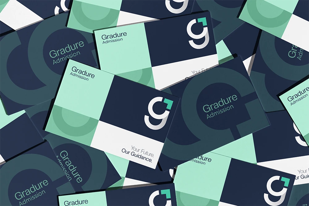
Pattern gives the brand its texture. The graphic patterns are made from repeating ‘g’ shapes and block forms, and sit mainly in dark blue with a single lighter accent block picked out in mint green, so one element always draws the eye. They work as backdrops, packaging motifs and brand signatures, and they never compete with the core message.
Colour and pattern together create a visual rhythm. The identity feels lively and engaging, and it still keeps the clean, professional presentation an education brand needs.


The identity was built for real use. We designed social media templates, icons and stationery, and put the brand into a full set of brand guidelines so the Gradure team can apply it consistently.
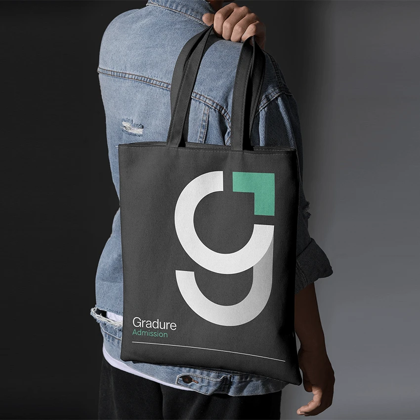
An identity only matters if it works where people meet it. For Gradure, we designed the applications that bring the brand to life: social media templates and icons, essential stationery such as business cards, and printed pieces like the admission booklet. Outdoor billboards, flags, a tote bag and branded buttons show the identity at larger and smaller scales.
Every asset was tested against real situations, including digital navigation, labels, brochures and point-of-sale displays. That functional approach is what makes a brand system perform inside customer journeys instead of only looking good in a presentation.
We also wrote comprehensive brand guidelines. They give the Gradure team what they need to apply the identity confidently and consistently across every touchpoint, and to keep new materials in line with the brand as it grows.
Gradure Admission is an education brand that guides students through admissions and toward their next step.
The challenge was to build an education brand that feels trustworthy and approachable, and that works across digital and physical touchpoints. Founder workshops defined three core values, Trust, Progression and Accessibility, and every design decision followed from them.
The identity is built around a custom ‘g’ logomark that stands for a student’s journey, supported by balanced typography, a flexible colour palette and a block-shaped pattern system. The collateral covers social media templates, icons, stationery and brand guidelines, so the Gradure team can use the brand consistently from signage to screen.
Narrative,
Creative Direction
Abhishek
Abhishek
Visual Identity,
Packaging Design,
Social Media Design
Sidharth
Sidharth
Say hi,
hello@slsh.studioLeave with a mark
Slash across the folded sheet. Every cut repeats eight times when it opens.
slsh.studio