INDIA,
INDIA,
11:13:23
11:13:23
Mangaluru Canteen
Mangaluru Canteen
Client :
Sachin
Year :
2025
Tags :
Creative Direction
Brand Identity
Collateral Design
Food & Drink
Mangaluru Canteen is a South Indian restaurant in Pune, created around the idea of bringing the food, familiarity, and visual character of Mangaluru to a new city. The challenge was to build an identity that felt rooted in where the food came from without making the restaurant feel dated or overly traditional.

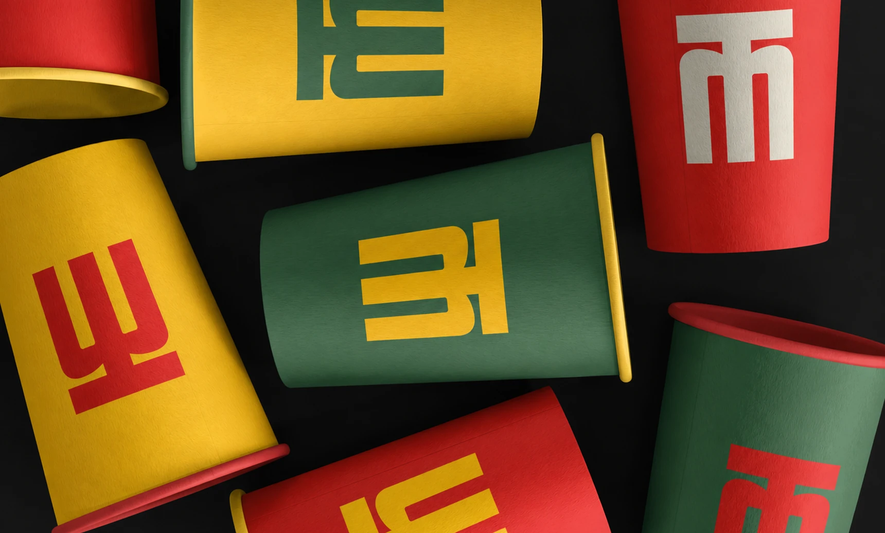
The identity takes cues from the boldness of South Indian signage, the colours of the region, and the everyday visual language of local eateries, then brings them together through a more contemporary and structured system. The result is a brand that feels familiar at first glance, but has enough character to stand on its own.
Mangaluru Canteen is a South Indian restaurant in Pune, built around bringing the food, familiarity and visual character of Mangaluru to a new city. Sachin came to us in 2025 for the restaurant's visual identity, packaging and social media direction, and the brief was specific. The restaurant had to feel rooted in where the food comes from without looking dated or overly traditional.
For a South Indian restaurant branding project, that balance is the whole job. Restaurants serving regional food in a new city usually pick one of two routes. They go heavily traditional, or they go generic and modern and lose the place they are serving. We started from the first source instead: the way South Indian eateries actually look and sound. The boldness of the signage, the colours of the region and the everyday visual language of a local canteen became the raw material.
The second step was structure. Those references are loud and varied on their own, so we organised them into a contemporary system with clear rules, so the restaurant branding reads as one brand wherever it appears. That structure is what keeps it from feeling like a theme. A first-time customer in Pune should recognise something familiar and still feel they are looking at a modern restaurant with its own character.
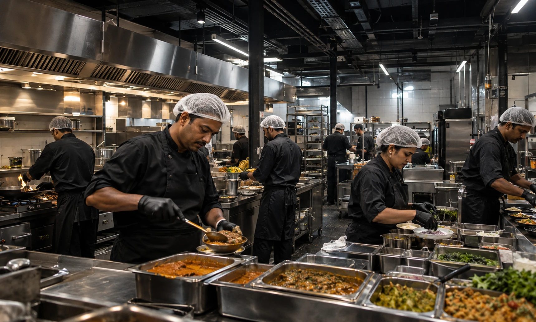

Rather than leaning on the usual visual shortcuts associated with South Indian restaurants, we looked at the things that actually make the culture recognisable - strong signboards, vivid colours, food served in familiar forms, old storefronts, tiled architecture, and the visual rhythm of everyday life around a canteen. The identity grew from this tension between familiarity and modernity. It needed to feel warm and approachable enough to be a neighbourhood restaurant, while having a strong enough visual presence to stand out in a new city.
The identity grew from this tension between familiarity and modernity. It needed to feel warm and approachable enough to be a neighbourhood restaurant, while having a strong enough visual presence to stand out in a new city.
South Indian restaurant branding is full of shortcuts: the same few symbols, the same borrowed motifs, the same idea of what the region looks like. Customers who know the food well tend to see through them quickly. So the research for Mangaluru Canteen started with observation. We looked at what makes a Mangaluru-style canteen recognisable to the people who grew up around one, and the list was concrete: signboards that are painted or built to be read from the street, vivid colours, food served in familiar forms, old storefronts, tiled architecture, and the rhythm of a canteen through the day.
Each of those is a real visual reference, and each can be translated into a restaurant identity without becoming a cliché. A strong signboard becomes a lesson in scale and confidence. Tiled architecture becomes a lesson in pattern and repetition. The food in its familiar forms stays honest, because the dishes already carry their own visual character.
The positioning problem sat between two needs. Mangaluru Canteen is a neighbourhood restaurant in Pune, so it has to feel warm and approachable, the kind of place people return to. It is also new to the city, so it needs enough visual presence to stand out among other restaurants. The identity came from holding both at once, which is why it feels familiar and modern together.

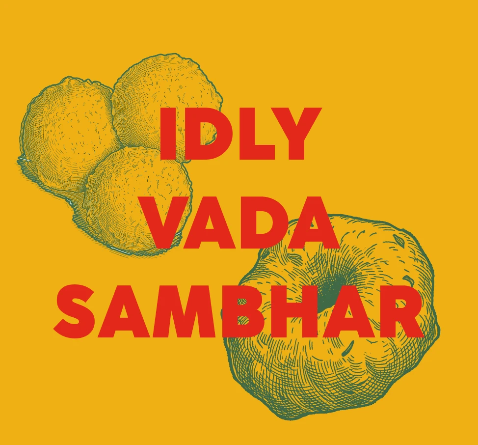

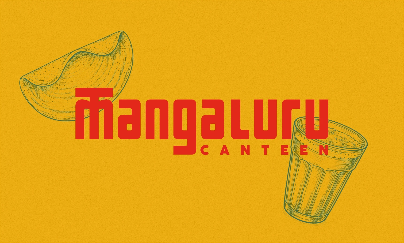
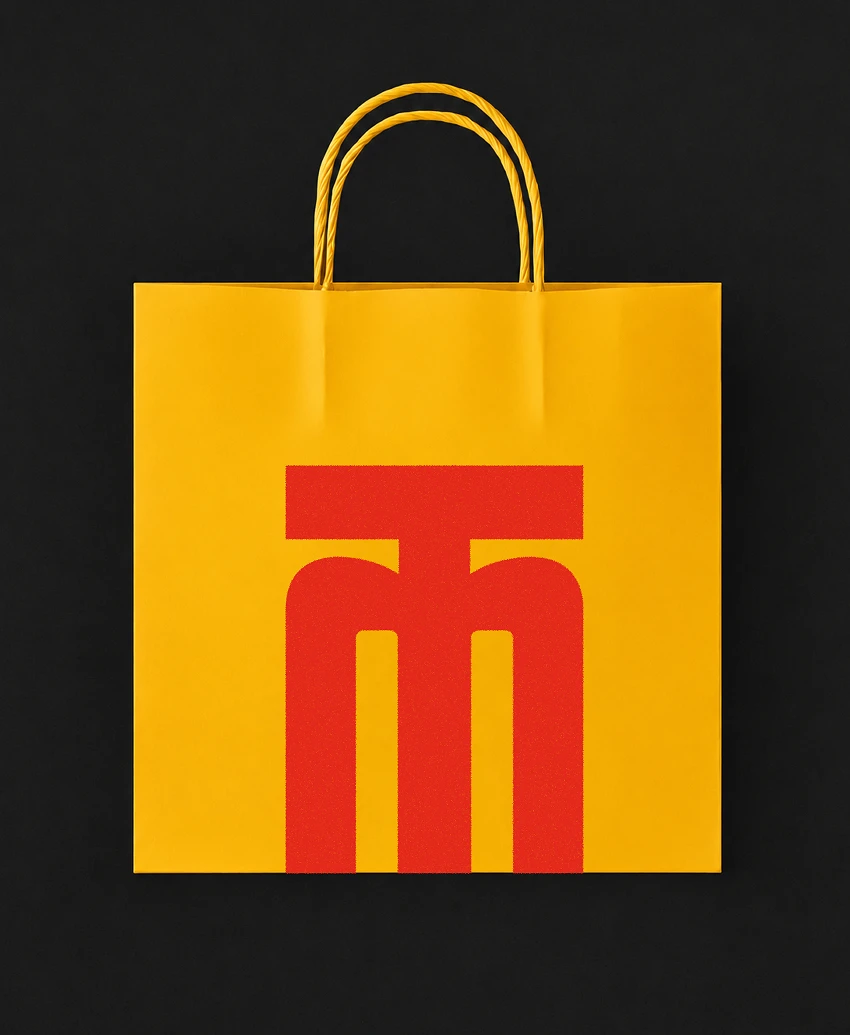
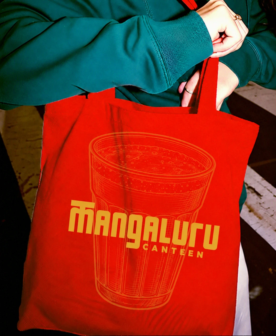
The logo started with the name itself. Instead of separating the identity from the wordmark, we wanted Mangaluru to become the identity. The lettering was custom-built with strong geometric forms, taking inspiration from the proportions and visual weight of South Indian signage. The unusual construction gives the wordmark a distinct personality, while the simpler supporting typography keeps the system grounded. The result is a logo that can work as a name, a sign, or a graphic element on its own.
The lettering was custom-built with strong geometric forms, taking inspiration from the proportions and visual weight of South Indian signage. The unusual construction gives the wordmark a distinct personality, while the simpler supporting typography keeps the system grounded.
The result is a logo that can work as a name, a sign, or a graphic element on its own.
For a restaurant logo design, the name carries the most weight. Mangaluru is the place the food comes from, so we made the name the identity. There is no separate symbol sitting beside the word. The custom wordmark is the brand, which keeps the restaurant's origin in front of customers every time they see it.
The lettering was built by hand with strong geometric forms. Its proportions and visual weight come from South Indian signage, where letters are made to be read from across a street and to hold their own on a busy storefront. That source gives the wordmark its unusual construction and its personality. Custom lettering like this is hard to mistake for a typeface, which matters for a new restaurant in a city where nobody knows the name yet.
A simpler supporting typeface sits around it. The wordmark is distinctive, so everything near it stays plain, and the system stays grounded and readable. The word Canteen is set small and spaced out beneath it, which keeps the focus on Mangaluru.
Because the logo is built like a sign, it works at three levels. It works as a name that people read, as a sign over a door, and as a graphic element that can stand on its own. That flexibility is useful for a restaurant brand that has to work across a storefront, a menu and a screen.



Mangaluru Canteen is a South Indian restaurant in Pune, created around the idea of bringing the food, familiarity and visual character of Mangaluru to a new city. It serves authentic South Indian food from the coast, as dine-in and takeaway, and its brand was designed to feel like a neighbourhood canteen from the first visit.
The challenge was to build a restaurant identity that felt rooted in where the food comes from without looking dated or overly traditional. Regional restaurant branding often relies on familiar shortcuts. Mangaluru Canteen needed to feel warm and approachable enough for a local restaurant, with enough presence to stand out in Pune.
The identity was developed from the boldness of South Indian signage, the colours of the region and the everyday visual language of local eateries, organised into a contemporary, structured system. The custom-built lettering turns the name Mangaluru into the identity itself. The same system carries through the packaging and the social media direction, so the brand feels familiar at first glance and has enough character to stand on its own.
Brand Strategy, Narrative, Creative Direction
Abhishek
Abhishek
Visual Direction, Icon Design, Web Direction
Sreerag
Sreerag
Brand Design, Visual Identity, Product Rendering
Sidharth
Sidharth
Say hi,
hello@slsh.studioLeave with a mark
Slash across the folded sheet. Every cut repeats eight times when it opens.
slsh.studio