INDIA,
INDIA,
11:13:23
11:13:23
Origins of
Origins of
Client :
Ar. Meet Bhandhari
Year :
2026
Tags :
Creative Direction
Brand Identity
E-Commerce
Home & Lifestyle
Website :
Instagram :
origins.of
Scent is the sense most tightly bound to memory and the one most carelessly sold. Home fragrance sits on the shelf between candles and air freshener, priced like a commodity and designed like one. Origins Of was built on the opposite premise: that what a room smells like is worth engineering.

Meet (the founder) came to us for the brand and the website. The reference he kept using was Dubai. A hotel there smells the same on the ground floor and on the fourth, at nine in the morning and at nine at night, and nothing he'd bought for his own house came close. Origins Of is his fix for that, and the engineering follows from it: no water, no heat, pure oil atomised at a steady rate.
That one sentence became our brief. Most home fragrance is sold by the bottle, and the smell is different every hour of the day. Meet wanted the opposite. He wanted a room to smell the same whenever you walked into it, the way a good hotel does. A waterless diffuser running pure fragrance oil at a constant rate is how the product gets there. Our job was to build a brand that could make the same promise before anyone had smelled anything.
So we started from the same philosophy. The brand takes that feeling outside the home and into the world. If the scent is built to be uniform in every room, the brand should be uniform everywhere someone meets it. Look at the brand identity, the social media and the website one after the other, and they should feel like the same thing. Someone who finds Origins Of on Instagram and then lands on the website should never wonder if they have ended up somewhere else.
Home fragrance brands tend to sell comfort through soft imagery, decorative lettering and a lot of visual noise. A product this precise needed the reverse. We wanted the minimal, high quality of the product to come through in the branding, so it is clean and easy to understand. The typeface is minimal. The logo is minimal. Every part of the identity was made to feel clinical and pristine, because that is how the product behaves.
For a premium home fragrance brand, that clarity is a strategic decision. Customers judge a luxury diffuser quickly and usually on a screen, so the brand strategy, visual identity and web design all had to communicate quality without explaining it. The result is a fragrance brand that looks as controlled and consistent as it smells.
For the main logo, we built a custom wordmark, drawn on a structured grid so it holds up at any size and stays balanced wherever it's used. It's the primary mark. It appears on the packaging, the interfaces and the communications more often than the monogram does.
Origins Of is a new home fragrance brand, so most people meet the name before they meet the product. The wordmark is that name drawn out in full, which is why it leads the brand identity. The monogram supports it. The wordmark is the logo people see on the bottle, on screen and in print.
Custom here means the letters were drawn for this name instead of typed out in an existing font. The logo design sits on a structured grid that sets the proportions, the spacing between letters and the curves. Because those relationships are fixed, the mark keeps its balance when it is scaled up or down, and nobody has to adjust it by eye for a new use.
The primary logo appears on the packaging design, across the website and other digital interfaces, and in brand communications such as social media and print. A bottle, a browser window and a business card all ask something different of a logo. The grid is what lets one wordmark meet all three without a separate version for each.
The wordmark also follows the logic of the product. Origins Of is built on consistency: a waterless diffuser that atomises pure oil at a steady rate, so a room smells the same at every hour. A wordmark that is plain, evenly spaced and identical everywhere makes the same promise visually, and it keeps the brand consistent from the first bottle to the last business card
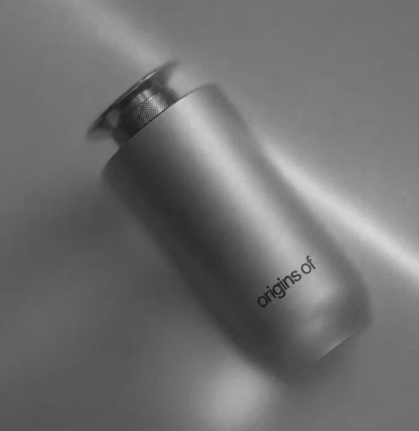
The typeface across the packaging and the website is Satoshi. It is a clean sans serif, chosen because it stays out of the way. The same type sits on the bottle and on the screen, so the product and the website read as one brand. Nothing in it is decorative, which suits a product built around precision.
Typography does quiet work in a premium home fragrance brand. For Origins Of we chose Satoshi, a clean sans serif typeface, for both the product packaging and every part of the web design. One typeface across both means the label on the bottle and the text on origins-of.com look like they were set by the same hand.
The reasoning follows the brief. The product is a waterless fragrance diffuser that atomises pure oil at a steady rate, and the brand needed to look as controlled as it performs. Satoshi's open, even letterforms stay legible in small packaging text and in longer lines on a screen, so product names, details and website copy read clearly without extra styling. There are no flourishes to date the brand or compete with the brushed metal bottle and the amber and copper imagery around it.
A single sans serif also keeps the brand typography simple to apply. Hierarchy is built from size, weight and spacing alone, so there is no second typeface to manage. That keeps packaging design, interface design and social media consistent with each other.


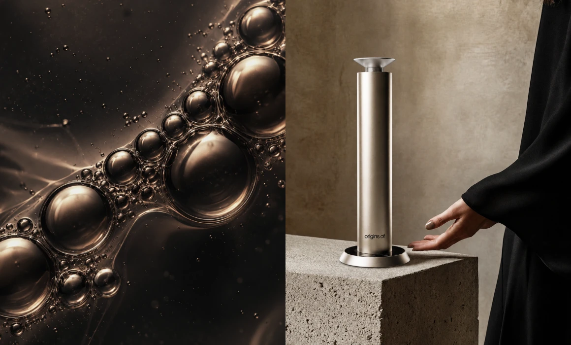
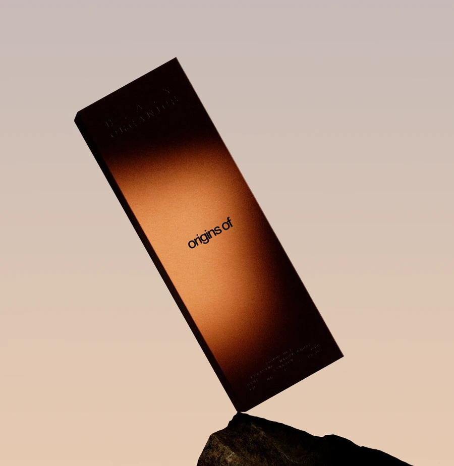


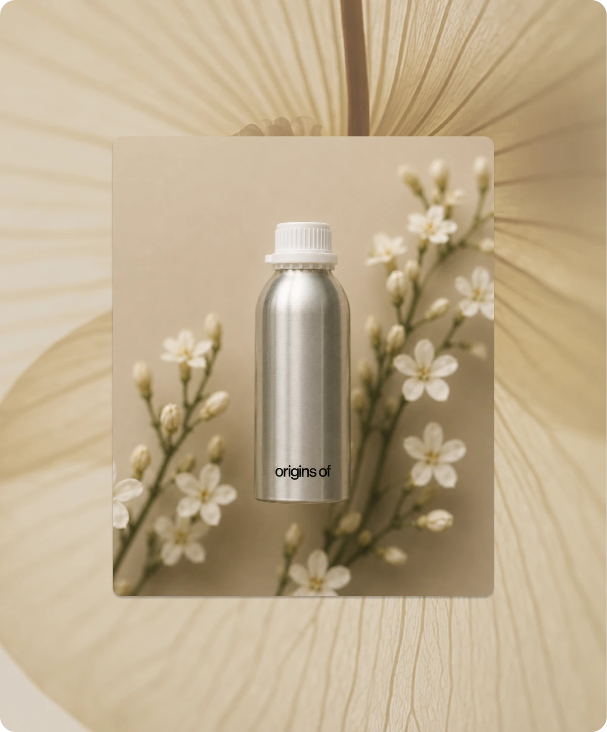





Origins Of is a waterless home fragrance diffuser. It uses no water and no heat, and it atomises pure oil at a steady rate, so a room smells the same in the morning and at night.
Origins Of is a home fragrance brand founded by Meet Bhandari, built around a waterless fragrance diffuser. The diffuser uses no water and no heat. It atomises pure fragrance oil at a steady rate, so the scent in a room stays level from morning to night.
The idea came from a simple comparison. A hotel in Dubai smells the same on the ground floor and on the fourth, at nine in the morning and at nine at night, and nothing Meet had bought for his own house came close. Origins Of brings that consistency into the home.
Home fragrance is a crowded category, and most of it is sold the same way. It sits on the shelf between candles and air fresheners, priced like a commodity and designed like one. Origins Of takes the opposite position and treats what a room smells like as something worth engineering. That places it at the premium end of home fragrance, with a product defined by how reliably it performs.
For anyone searching for a waterless diffuser, a pure oil home diffuser or a way to make every room smell the same, the answer is simple. A waterless fragrance diffuser releases scent by atomising pure oil instead of mixing it with water or heating it, and Origins Of is built around that method.

Origins Of is a home fragrance brand built on the idea that what a room smells like is worth engineering. Its waterless diffuser uses no water and no heat. It atomises pure fragrance oil at a steady rate, so a room smells the same in the morning and at night. Founder Meet Bhandari started it after noticing that a hotel in Dubai smells the same on every floor at every hour, and that nothing he had bought for his own home came close.
The challenge was to build a brand that made the same promise as the product. Home fragrance is usually sold between candles and air fresheners, priced like a commodity and designed like one. Origins Of needed a brand identity that looked as controlled and consistent as the diffuser performs, across packaging, website and social media.
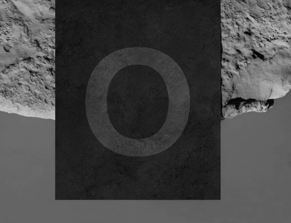
Every element was developed against that idea of uniformity. The custom wordmark is drawn on a structured grid, the monogram is a single letter O that finishes where it starts, and Satoshi carries the typography across packaging and web. The result is a premium home fragrance brand where the brand strategy, product, website at origins-of.com and Instagram presence read as one system.
Brand Strategy, Narrative, Creative Direction
Abhishek
Abhishek
Visual Direction, Icon Design, Web Direction
Sreerag
Sreerag
Brand Design, Visual Identity, Product Rendering
Sidharth
Sidharth
Say hi,
hello@slsh.studioLeave with a mark
Slash across the folded sheet. Every cut repeats eight times when it opens.
slsh.studio