INDIA,

INDIA,

11:13:23

11:13:23

PEAQ

PEAQ

Client :

Kevin Prichard, Learoid D’Monte

Year :

2025

Tags :

Creative Direction

Packaging Design
Health & Wellness

PEAQ is a peptide brand, and this project covers its packaging design. For clients Kevin Prichard and Learoid D’Monte, who created the PEAQ logo, we designed the packaging for the product: the vial, its label and supplement facts panel, the metal containers and a retail bag. The direction treats peptide packaging like precision equipment. The surfaces are cool and metallic, the forms are exact, and bright gradient colour sits on a dark base.

The stacked PEAQ monogram engraved into a slab of grey stone, shown in black and white.
Black-and-white close-up of a woman holding a small PEAQ BPC-157 glass vial with a silver cap beside her lips.

The packaging starts from a contrast. Peptides are a scientific product, so the pack had to look precise. They also come from raw material, so glass and brushed metal are set against dark stone and mineral surfaces. The PEAQ logo sits quietly on top of both.

The packaging starts from a contrast. Peptides are a scientific product, so the pack had to look precise. They also come from raw material, so glass and brushed metal are set against dark stone and mineral surfaces. The PEAQ logo sits quietly on top of both.

A white PEAQ product label for Pure BPC-157 500mcg with the monogram and a supplement facts panel, on black.
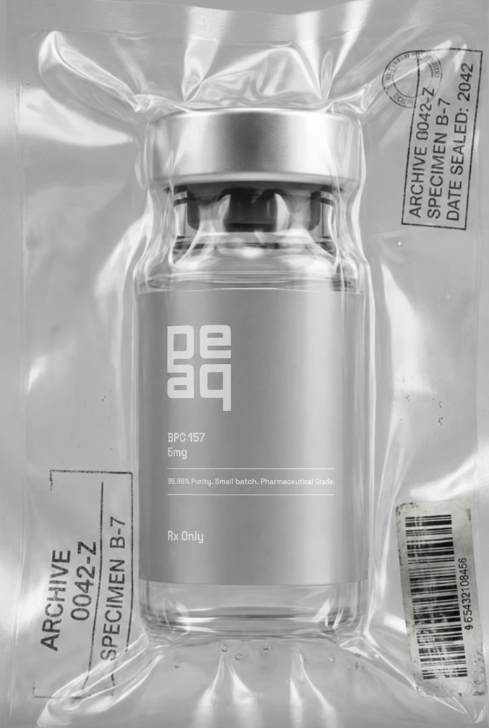
A PEAQ BPC-157 vial vacuum-sealed in clear plastic and stamped "Archive 0042-Z, Specimen B-7", with a barcode sticker.
A stack of rounded brushed-metal PEAQ containers with the monogram embossed on one lid, in black and white.
A frosted silver rounded-square PEAQ app icon with an embossed monogram on black.

Every piece follows one packaging system: the vial and its label, the clear outer packaging, and the brushed metal containers. The shapes are simple and the corners are soft, so the products read as one family on a shelf and in photography.

Every piece follows one packaging system: the vial and its label, the clear outer packaging, and the brushed metal containers. The shapes are simple and the corners are soft, so the products read as one family on a shelf and in photography.

A hand carrying a metallic silver PEAQ shopping bag with violet handles and a violet gradient wordmark.
Front view of a silver PEAQ shopping bag with violet handles, a violet gradient wordmark and the line "human performance, powered by peptides", on black.
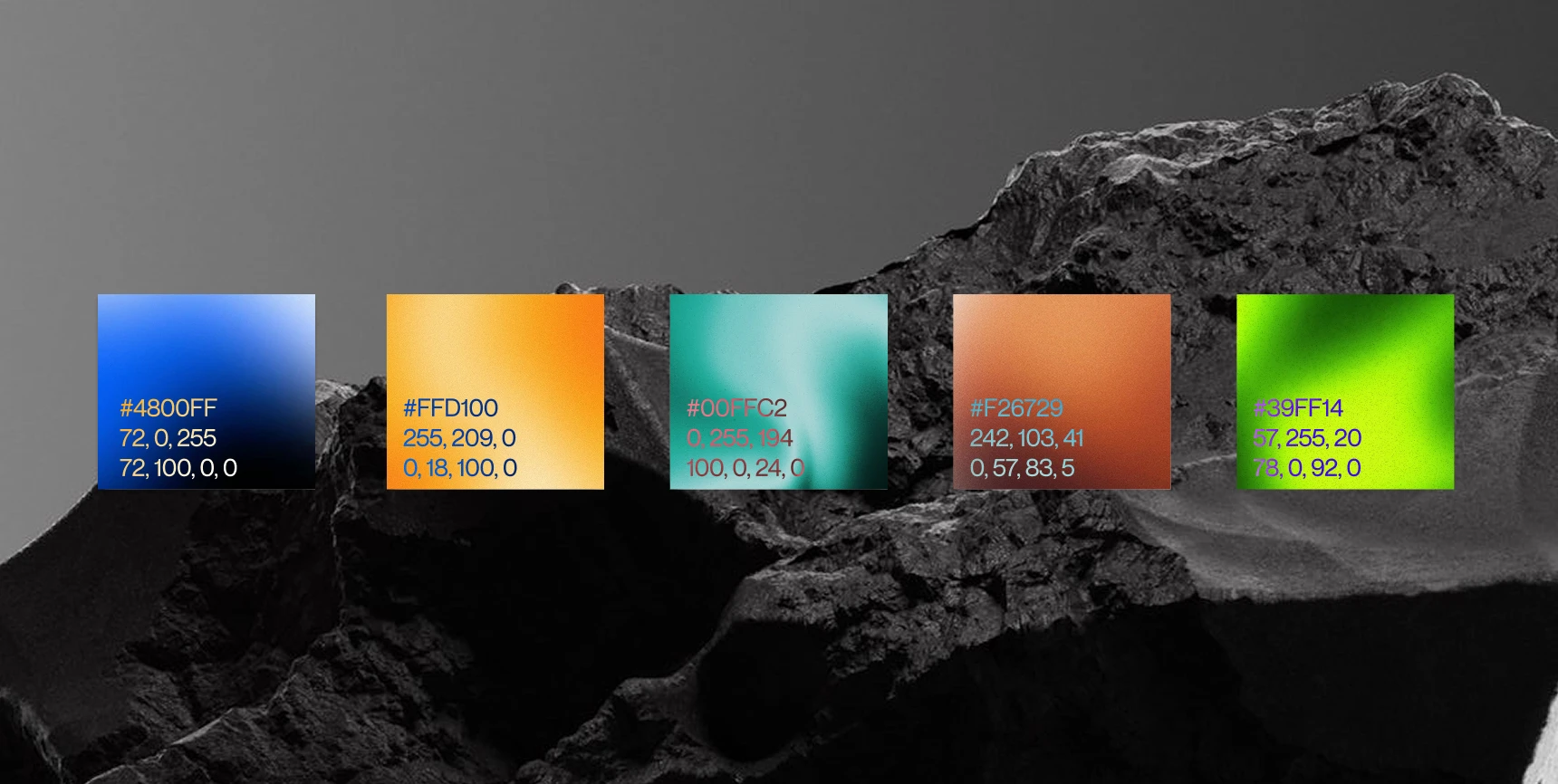
The PEAQ colour palette as five gradient swatches — violet, yellow, aqua, orange and neon green — with hex, RGB and CMYK values, over a dark rock landscape.

PEAQ is a peptide brand, and its products are described by the line “peptide powered protocols”. We designed its packaging in 2026 with clients Kevin Prichard and Learoid D’Monte. Our work covers the packaging design and the creative direction behind it.

The challenge was to make a peptide pack that looks precise and premium and still has character. The design philosophy pairs clear glass and brushed metal with raw stone and mineral surfaces, all built on a dark base. The packaging system runs from the vial and its label to the clear outer packaging, the metal containers and a frosted retail bag with blue to violet gradient handles.

Packaging Design, Creative Direction, Product Rendering

Sidharth

Sidharth

Say hi,

hello@slsh.studio

Leave with a mark

Slash across the folded sheet. Every cut repeats eight times when it opens.