INDIA,

INDIA,

11:13:23

11:13:23

A red-orange shop awning on a pink tiled wall, printed with the cream "RICO ROLLS" wordmark and the wrap mascot in sunglasses riding a surfboard.

Rico Rolls

Rico Rolls

Client :

Mr. Ranjith Rejeev

Year :

2025

Tags :

Brand Identity
Packaging Design

Food & Drink

Rico Rolls is a fast-casual café in Kochi serving wraps, rolls and specialty coffee. We built its brand identity and packaging design around speed, flavour and everyday accessibility: a custom wordmark, a friendly mascot, a modular takeaway packaging system and a locked palette of red-orange, cream and black. The result is a quick-service restaurant brand that is easy to recognise on a storefront sign, a delivery bag or a phone screen.

A top-down spread on a wooden table: a fries carton, a burger and a roll in illustrated wrapping paper, tomato sauce sachets, a wrapped straw and a cup lid, all in red-orange and cream Rico Rolls branding.

Rico Rolls came to us wanting to stand out in Kochi’s busy café and quick-service scene. The menu was strong, with fresh wraps, rolls and premium brews. The branding in front of it lacked personality and visibility.

Rico Rolls came to us wanting to stand out in Kochi’s busy café and quick-service scene. The menu was strong, with fresh wraps, rolls and premium brews. The branding in front of it lacked personality and visibility.

A chicken wrap in a kraft paper sleeve on an orange background, printed in black with the wordmark, the surfing and chef mascots and "Rolling out happiness!".
A round orange lightbox sign reading "RICO ROLLS — Rolling out happiness!" mounted under a terracotta tiled roof above an outdoor food court.
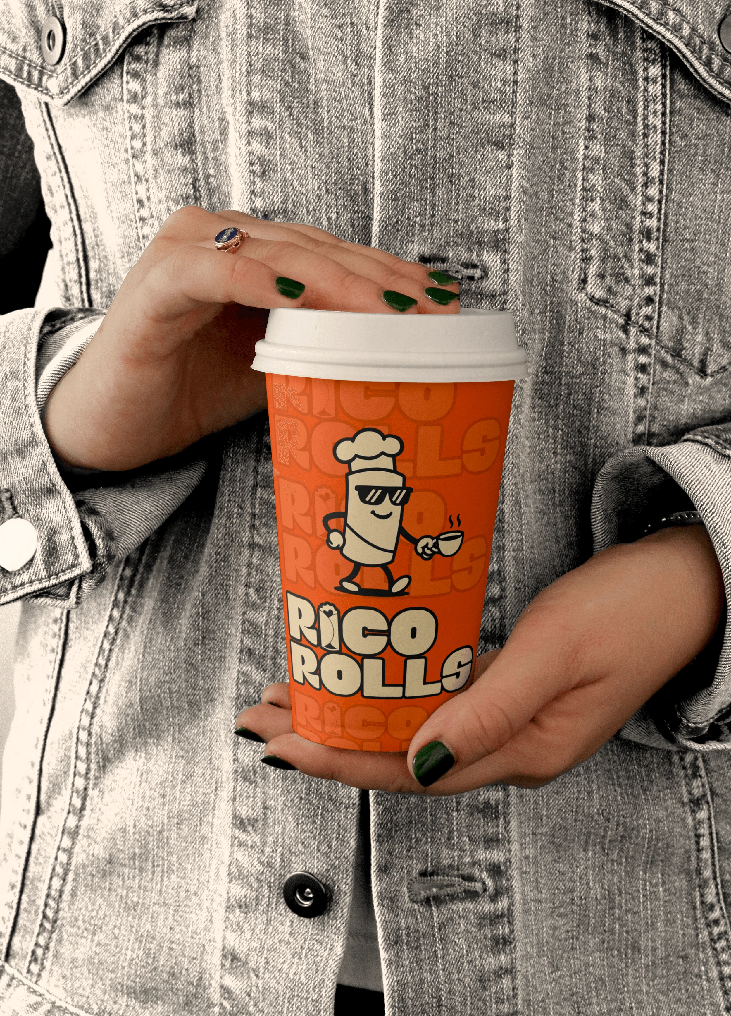
Hands holding an orange takeaway cup printed with the wordmark and the chef mascot carrying a coffee cup, against a grey denim jacket.

The custom wordmark was designed to read clearly on a narrow wrap and on a large sign. Rounded counters make it approachable, tight letterspacing keeps it compact, and a slight forward slant gives it momentum. A friendly roll character appears sparingly to add tone.

The custom wordmark was designed to read clearly on a narrow wrap and on a large sign. Rounded counters make it approachable, tight letterspacing keeps it compact, and a slight forward slant gives it momentum. A friendly roll character appears sparingly to add tone.

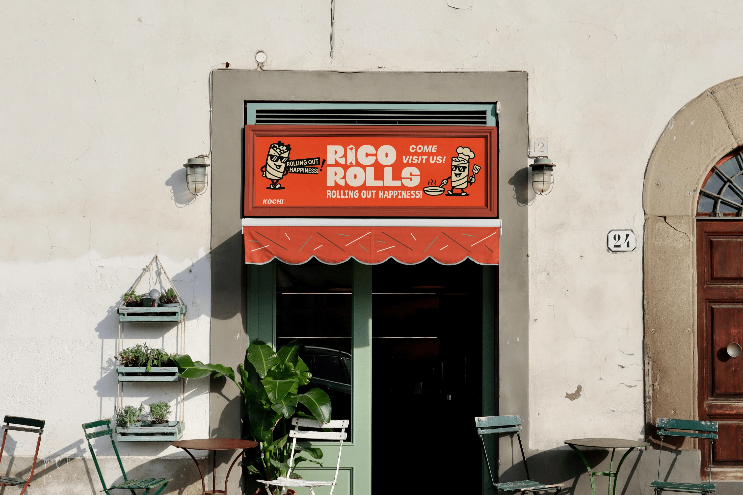
A red shop sign above a green doorway reading "RICO ROLLS", "Rolling out happiness!", "Come visit us!" and "Kochi", flanked by two mascots, with a scalloped red awning and café chairs below.
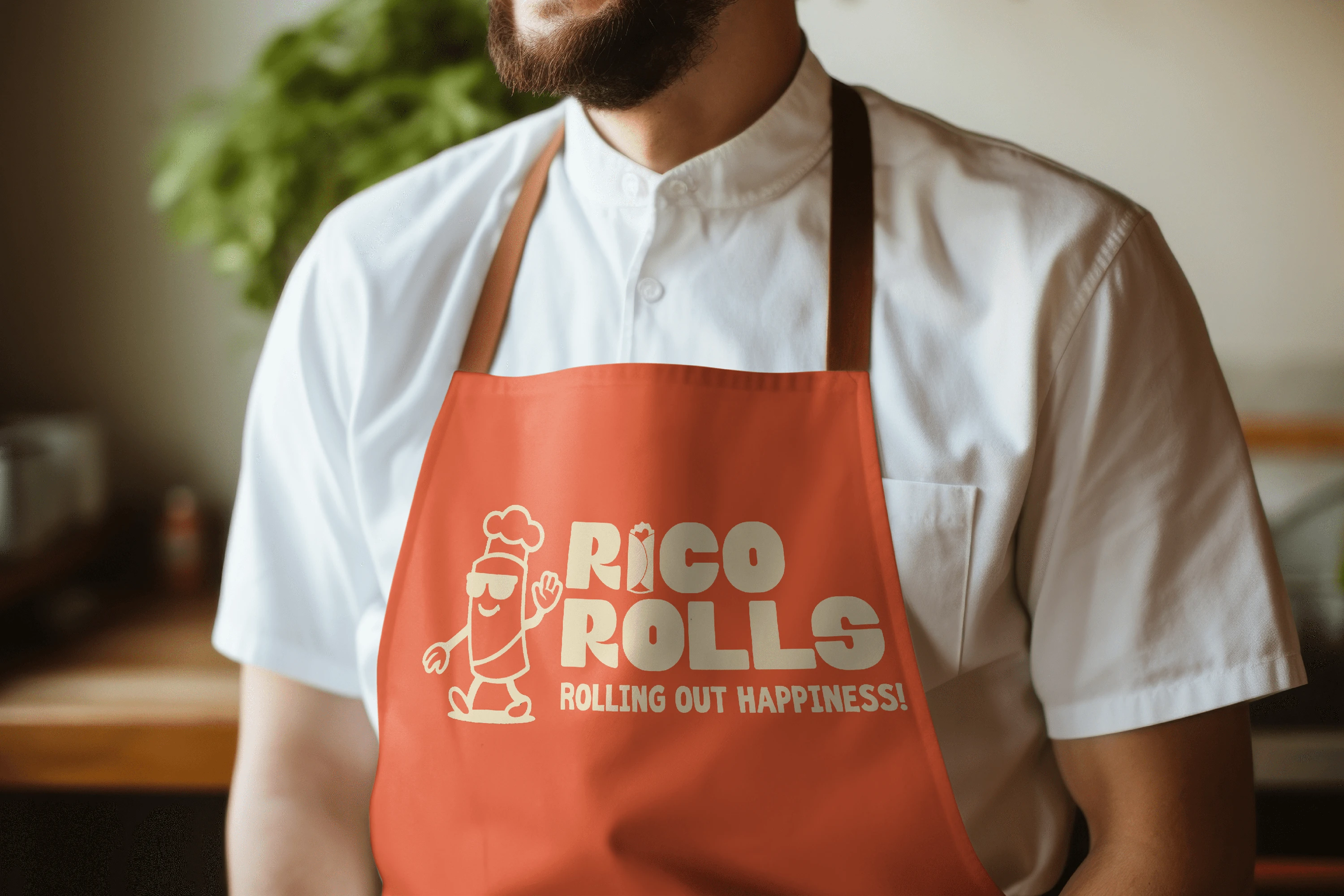
A bearded cook in a white shirt wearing an orange apron printed in cream with the waving chef mascot, the wordmark and "Rolling out happiness!".

The packaging works as a modular system built for busy service. Bold bands keep the wordmark readable from any angle, formats are made to stack, and circular stickers and tab labels carry flavour and prep codes.

The packaging works as a modular system built for busy service. Bold bands keep the wordmark readable from any angle, formats are made to stack, and circular stickers and tab labels carry flavour and prep codes.

Business cards on a cream and red stepped surface: a cream back with a repeated wordmark pattern and the chef mascot, and orange fronts with the wordmark and a name.

The palette is locked to four colours: a red-orange accent, two warm neutrals and black. Materials are matte and uncoated, and the photography is clean and close, so the food looks warm and real.

The palette is locked to four colours: a red-orange accent, two warm neutrals and black. Materials are matte and uncoated, and the photography is clean and close, so the food looks warm and real.

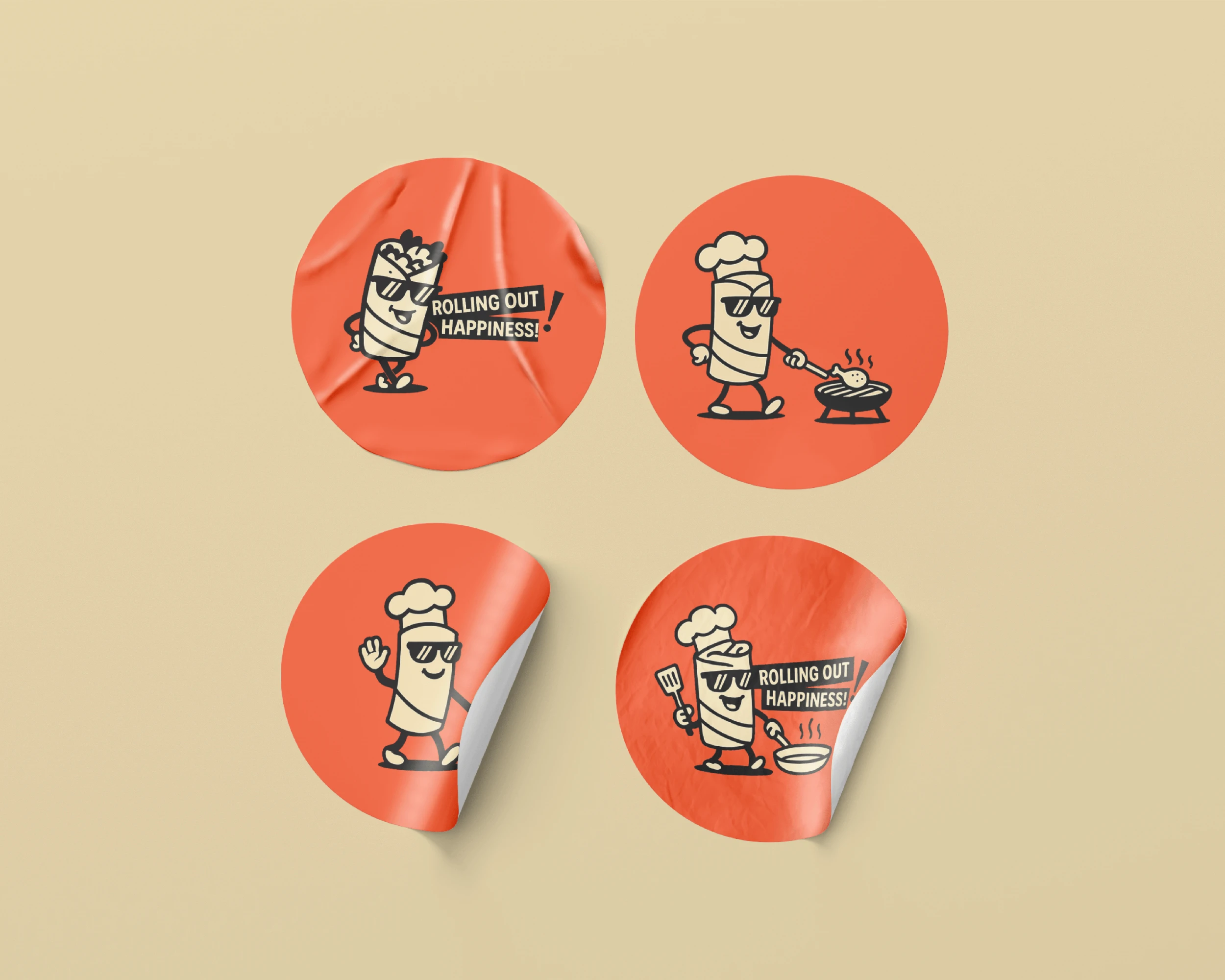
Four round orange stickers on a beige background, each showing the wrap mascot: with "Rolling out happiness!", grilling chicken, waving, and frying with a pan and spatula.

Rico Rolls is a fast-casual café in Kochi serving fresh wraps, rolls and premium brews, built around flavour, speed and everyday accessibility. We developed its brand identity and packaging design in 2025.

The challenge was to build a quick-service restaurant brand with enough personality to stand out in a competitive market, and to make it work across storefront signage, delivery packaging, menu boards and digital touchpoints. The previous branding lacked personality and visibility.

The identity rests on three principles: clarity, motion and appetite. A custom wordmark with rounded counters and a forward slant leads the brand, a friendly roll mascot adds character, and a modular packaging system carries it through takeaway and service. A locked palette, matte materials and clean photography direction keep it consistent. The identity was built to help the brand be recognised faster at the point of sale, perform better on social media and support quick service.

Visual Identity,

Packaging Design,

Social Media Design

Sidharth

Sidharth

Say hi,

hello@slsh.studio

Leave with a mark

Slash across the folded sheet. Every cut repeats eight times when it opens.