INDIA,
INDIA,
11:13:23
11:13:23
Staclogis
Staclogis
Client :
Ar. Jeffrine Santhosh
Year :
2026
Tags :
Creative Direction
Brand Identity
Collateral Design
Industrial & Logistics
Website :
Staclogis is an industrial and logistics infrastructure company based in Chennai, focused on developing scalable warehousing, storage and integrated logistics ecosystems for the future of commerce and supply chain operations. The ambition behind the company called for an identity that could communicate more than logistics alone. It needed to feel structured, substantial and capable of operating at scale.
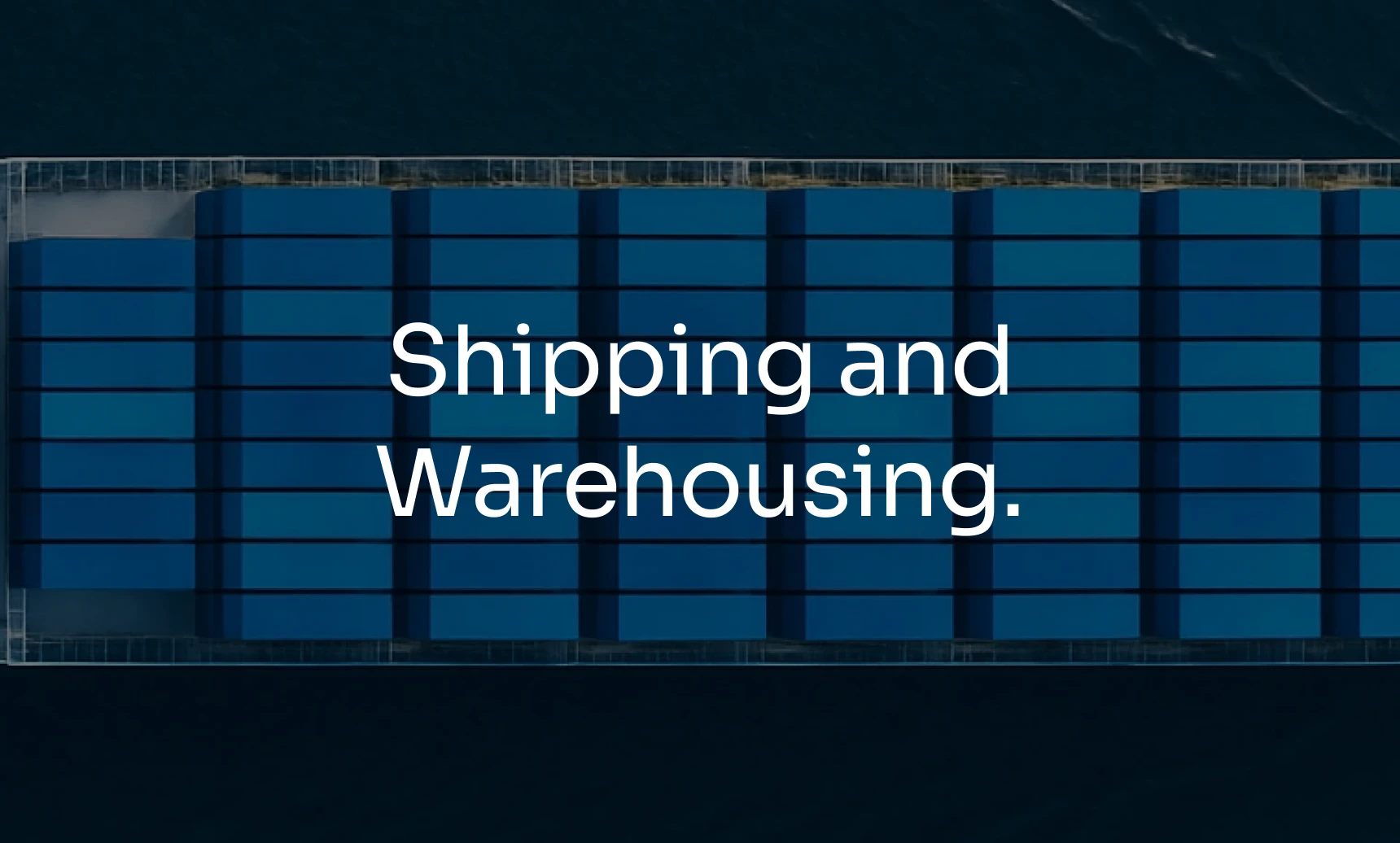
The Staclogis identity takes its starting point from the shipping container, a modular structure at the heart of modern logistics. Its simple geometry provides the foundation for the monogram, with the letter S contained within the form to create a mark that feels immediately connected to the world Staclogis operates in. The result is a distinctive symbol that can move comfortably between corporate communication, industrial environments and digital applications.
The result is a distinctive symbol that can move comfortably between corporate communication, industrial environments and digital applications.
Staclogis is an industrial and logistics infrastructure company based in Chennai. It develops scalable warehousing, storage and integrated logistics ecosystems for the future of commerce and supply chain operations. Ar. Jeffrine Santhosh brought us in 2026 for the visual identity, brand identity and collateral design, and the brief asked for more than a logistics look. The identity had to feel structured, substantial and capable of operating at scale.
Logistics branding tends to reach for the same few images: arrows, globes, trucks in motion. They signal the industry but say nothing specific about the company. We went to the one object that sits under all of it. The shipping container is a modular structure, built to be stacked, moved and repeated. It is how goods move through warehousing, shipping and supply chains, and it describes the way a company like Staclogis builds capacity, one unit at a time.
That is why the container became the starting point for the brand identity. Its simple geometry is easy to reduce, and it gives the monogram its foundation, with the letter S held inside the form. Anyone in the industry reads it immediately as a logistics symbol, and it still belongs to Staclogis because of the S inside it.
A logistics logo has to work across very different settings. Corporate communication needs it to look credible. Industrial environments need it to be clear and solid. Digital applications need it to hold up on a screen. A symbol built from a container's geometry moves between all three without changing.

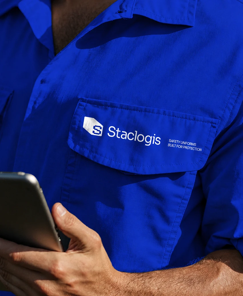
The container provides the outer framework while the S establishes the brand within it. The monogram is constructed through a precise geometric system, giving it a strong silhouette and consistent proportions across different sizes and applications. Its simplicity allows the mark to work independently, while its distinctive structure gives Staclogis a recognisable visual signature.
Its simplicity allows the mark to work independently, while its distinctive structure gives Staclogis a recognisable visual signature.
The Staclogis monogram is built in two parts. The container is the outer frame, and the S sits inside it. The frame says what industry the company works in, and the S says who the company is. Each part has a clear job, which is why the mark reads quickly.
The construction matters as much as the idea. The monogram follows a precise geometric system, so its lines, angles and proportions are set rather than drawn by eye. For a warehousing and logistics company, that is the right kind of detail. It gives the logo a strong silhouette, and the system keeps the proportions the same whenever the mark is scaled up or down. The same monogram can sit small on a document header or large on a facility without changing character.
A silhouette is also what people remember. Industrial logo design works best when the shape is recognisable before the details are read, and a contained S inside a container form gives Staclogis that.
The mark is simple enough to stand alone, without the full name beside it. Its distinctive structure gives the company a recognisable visual signature across warehousing, storage and supply chain communication.

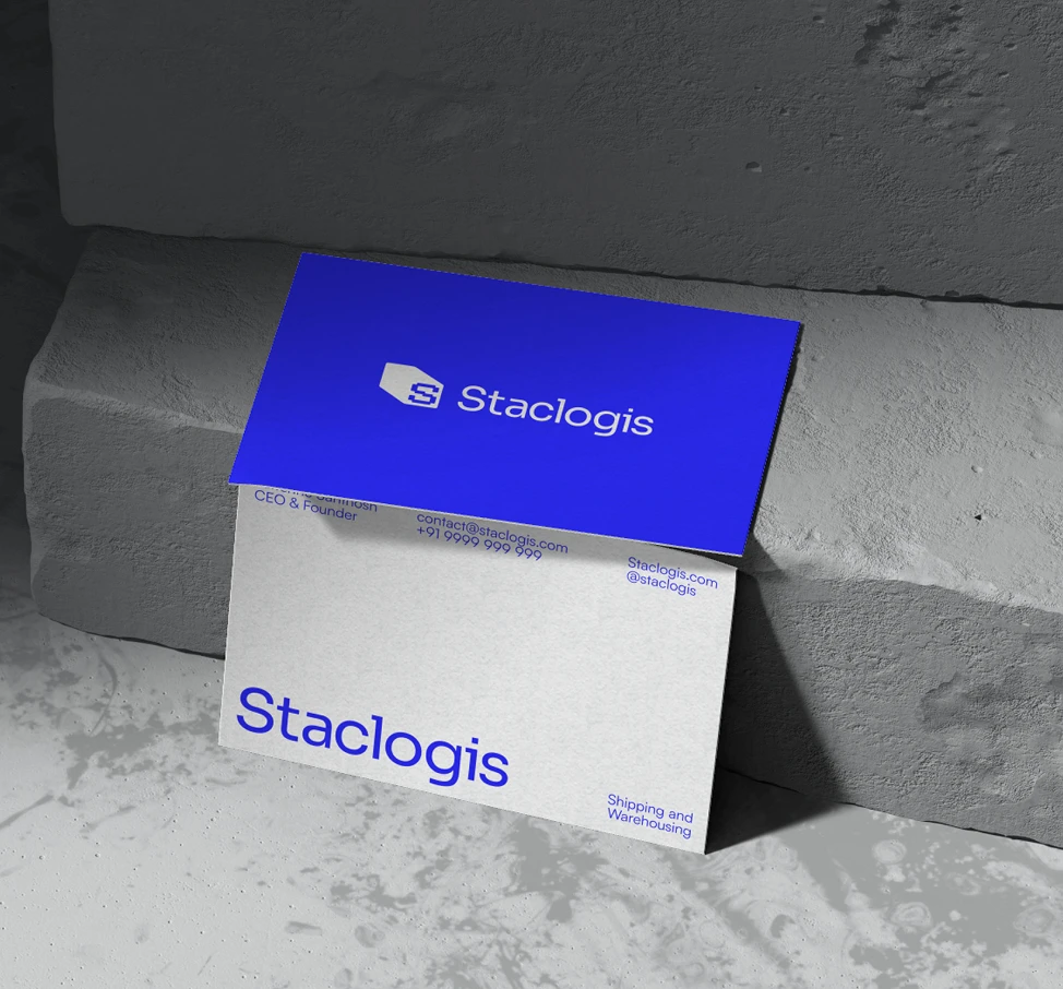

Sora Variable forms the typographic foundation of the identity, giving the brand a contemporary and structured voice across headlines, information and everyday communication. The colour system builds around a strong blue, supported by black and white with orange used as an accent. Together, typography and colour create a clear hierarchy that gives the identity both presence and flexibility.
The colour system builds around a strong blue, supported by black and white with orange used as an accent. Together, typography and colour create a clear hierarchy that gives the identity both presence and flexibility.
Typography and colour decide how a logistics brand feels once the logo is out of the picture. For Staclogis, Sora Variable carries the written voice of the brand. It is a contemporary typeface with a structured, even feel, and it covers headlines, information and everyday communication from one family. A logistics company puts out a lot of practical text, from service details to documents to signage, so a single typeface keeps all of it consistent.
The colour system is built around a strong blue. Blue is common in logistics and corporate branding, so the choice is deliberate and the discipline around it matters. Black and white support it, and orange is used as an accent. That restraint keeps the blue dominant and gives the orange a clear job, which is to draw the eye to what matters.
Together the two systems create a visual hierarchy. Large blue areas and clear headlines give the identity presence in industrial and corporate settings, and the supporting colours and the single typeface keep it flexible enough for different formats. It is a straightforward system for a company that needs to look established and capable from the first impression.


Staclogis is an industrial and logistics infrastructure company based in Chennai. It develops scalable warehousing, storage and integrated logistics ecosystems for the future of commerce and supply chain operations, with shipping and warehousing at the centre of what it does.
The challenge was to build a brand identity that said more than logistics alone. It needed to feel structured, substantial and capable of operating at scale, and to work across corporate communication, industrial environments and digital applications.
The identity starts from the shipping container, a modular structure at the heart of modern logistics. Its geometry became the foundation for the monogram, with the letter S held inside the form. Sora Variable carries the typography, and the colour system builds around a strong blue, supported by black and white with orange as an accent. The visual identity extends into collateral design, giving Staclogis a recognisable look wherever it appears.
Brand Strategy, Narrative, Creative Direction
Abhishek
Abhishek
Visual Direction, Icon Design, Web Direction
Sreerag
Sreerag
Brand Design, Visual Identity, Product Rendering
Sidharth
Sidharth
Say hi,
hello@slsh.studioLeave with a mark
Slash across the folded sheet. Every cut repeats eight times when it opens.
slsh.studio