INDIA,
INDIA,
11:13:23
11:13:23
Terra Curry
Terra Curry
Client :
Sandeep Namboodiry, Anam Kalsia
Year :
2026
Tags :
Creative Direction
Brand Identity
Web Design
Food & Drink
Website :
Instagram :
Good food should leave you feeling good, not weighed down.
That was the thought that shaped our approach to Terra Curry. We built a brand around the idea that regional Indian comfort food could feel nourishing, contemporary, and full of character without losing its roots.
From the visual identity to the website experience, every touchpoint was designed to bring this philosophy to life. Because branding isn’t just how a place looks. It’s how the entire experience feels.


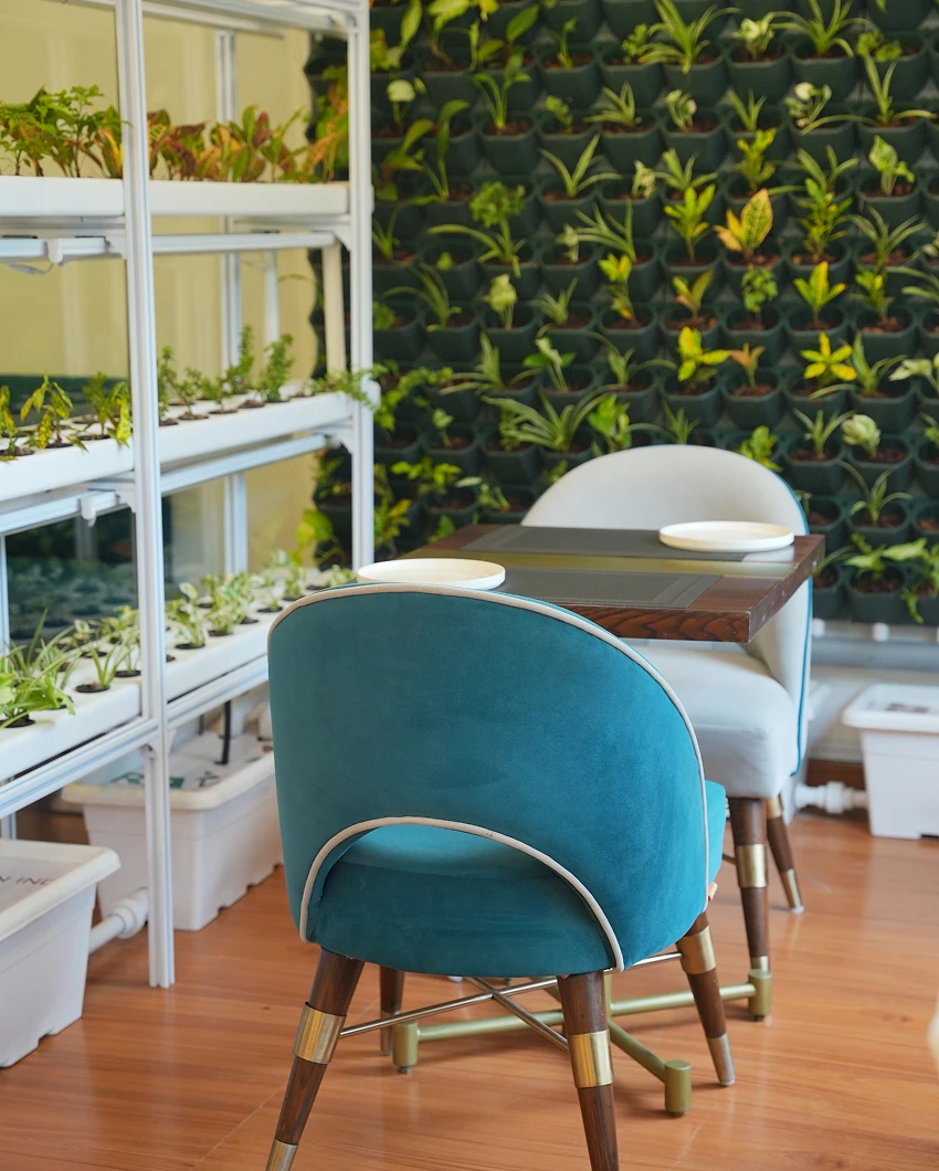
IMAGE SOURCE: Sandeep Namboodiry, @feelgood.at.terracurry
Terra Curry brings together the calming lightness of nature-inspired interiors and the distinctive TerraBowls, each inspired by the diverse terrains and regional flavours of India, from North to South. With Terra meaning “Earth,” the experience goes beyond a conventional restaurant. This philosophy shaped our approach to the logo and visual identity, creating a brand rooted in nature, regional diversity, and contemporary comfort.
The Concept Behind Terra Curry
Terra Curry reimagines the Indian dining experience by bringing together regional comfort food, nature, and a thoughtfully designed indoor environment. With microgreens, an integrated air-quality monitoring system, and an emphasis on lighter, plant-forward meals, the restaurant aims to create an experience that feels as refreshing as it is satisfying. The idea is simple: leave feeling physically light, yet completely fulfilled.
Translating the Experience into a Brand
We translated this philosophy into two core elements: the TerraBowl monogram and the Terra Curry wordmark. Inspired by the earth and the diverse terrains of India, the monogram brings together rounded, layered forms that represent the restaurant's signature bowls and their connection to the land. The wordmark carries the same earthy character through bold typography, softened corners, and a distinctive, contemporary silhouette.
The colour palette draws from the restaurant's existing interiors, creating a natural connection between the physical space and its visual identity. To balance the earthy foundation with the futuristic direction outlined in the brief, we introduced a bright fluorescent green as an accent, adding energy, contrast, and a forward-looking edge.
The result is an identity that feels grounded yet futuristic, familiar yet distinctive, reflecting Terra Curry's ambition to make Indian comfort food a lighter, more considered experience.
For TerraCurry, Random Grotesque captures the brand’s vision of reimagining Indian dining through a progressive lens. Its contemporary character complements the futuristic identity while retaining a sense of warmth and approachability. Clear, confident, and distinctive, the typeface reflects the brand’s values of innovation, transparency, and simplicity, creating a visual voice that feels modern yet timeless.
Typography: Random Grotesque
For TerraCurry, Random Grotesque was selected to bridge the gap between traditional Indian comfort food and a more futuristic, contemporary dining experience. Its bold, geometric character brings a sense of precision and modernity to the identity, while its clean, straightforward letterforms keep the brand approachable and easy to recognise.
The typeface moves away from the ornate, heritage-driven typography often associated with Indian food brands, positioning TerraCurry within a new visual language that feels progressive, confident, and culturally relevant. Its strong forms create visual impact across packaging, signage, and digital touchpoints, while its legibility ensures the brand communicates clearly across different formats.
This balance of boldness and accessibility also makes the typeface particularly relevant to a Gen Z audience that gravitates towards distinctive visual identities, contemporary aesthetics, and brands that challenge category conventions. Rather than feeling overly technical or cold, Random Grotesque adds personality to TerraCurry’s futuristic direction without compromising warmth.
Paired with the earthy colour palette drawn from the restaurant’s interiors and the vibrant fluorescent green accent, the typography creates a compelling contrast between nature and technology. The result is a visual identity that feels grounded yet forward-thinking, familiar yet unconventional, and designed to remain relevant as TerraCurry evolves.


We developed initial concepts for TerraCurry’s physical branding, exploring how the identity could translate across everyday customer touchpoints. From staff uniforms and takeaway packaging to cups and serving essentials, each application was designed to carry the brand’s earthy yet futuristic character into the real world, creating a consistent and recognisable experience beyond the restaurant.
Bringing the Brand into the Physical World
With TerraCurry’s visual identity established, we explored how the brand could extend beyond the logo and become part of the everyday dining experience. The objective was to create a cohesive physical identity that felt as distinctive as the concept itself, bringing together earthy influences, contemporary aesthetics, and a futuristic edge.
We developed initial concepts across multiple customer and operational touchpoints, including staff uniforms, takeaway packaging, beverage cups, and serving essentials. Each application was approached as an opportunity to reinforce the brand’s personality while maintaining consistency across different materials, formats, and contexts.
The deep teal foundation creates a strong visual connection to TerraCurry’s interiors, while the contrasting mint tones introduce freshness and clarity. Bold typography ensures immediate recognition, and subtle graphic elements add depth without overwhelming the overall design. We also explored how the identity could work across different finishes and surfaces, from printed packaging to reusable-looking cup formats and branded apparel.
Beyond aesthetics, the concepts were designed to consider how customers interact with the brand. Takeaway packaging becomes an extension of the dining experience, staff uniforms create a consistent brand presence, and cups and serving essentials help carry the identity into moments of everyday use. Together, these touchpoints build recognition and make the experience feel intentional from the first interaction to the last.
These initial explorations established a visual direction for TerraCurry’s physical branding, demonstrating how one identity could adapt across applications without losing its character. The goal was not simply to place a logo on different objects, but to create a connected brand experience that feels contemporary, recognisable, and true to TerraCurry’s philosophy of reimagining Indian comfort food.


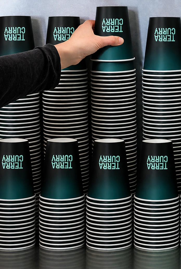

We developed a set of custom gradients and typographic patterns to extend TerraCurry’s visual identity beyond its core elements. The gradients blend earthy neutrals, deep teals, and soft mint tones, adding depth while reinforcing the brand’s connection to nature and its futuristic direction. The oversized, scattered letterforms create a bold, contemporary pattern that brings movement and personality to the identity, making it adaptable across packaging, digital assets, and other brand touchpoints.
Building a Cohesive Visual Language
To make TerraCurry’s identity feel consistent across every interaction, we extended the custom gradients and typographic pattern across both physical and digital touchpoints. Rather than treating them as decorative elements, we developed them as a flexible visual system that could carry the brand’s personality across different formats while maintaining a recognisable identity.
The gradients bring depth and atmosphere to the brand, blending deep teals, earthy neutrals, and soft mint tones to reflect the balance between nature and technology. Applied across packaging, cups, takeaway materials, promotional graphics, and other physical applications, they introduce variation without compromising visual consistency. The subtle transitions between colours also create a sense of movement, giving the identity a more contemporary and futuristic character.
The typographic pattern adds a bolder layer to this system. By enlarging, cropping, rotating, and scattering letterforms from the brand’s typography, we created a distinctive graphic language that feels expressive and unconventional. This pattern allows the identity to move beyond repetitive logo placement, bringing texture, scale, and personality to different applications while keeping the brand instantly recognisable.
We carried the same visual language into TerraCurry’s website, translating the gradients and typographic patterns into the digital experience. The oversized letterforms introduce visual rhythm, while the gradients help establish atmosphere and create transitions between sections. Together, these elements connect the website to the restaurant’s physical identity, ensuring that the brand feels familiar whether someone encounters it through packaging, in the restaurant, or on a screen.
The result is a cohesive design system that offers flexibility without fragmentation. Every application has room to express itself, yet the shared colours, gradients, typography, and patterns tie everything together into one recognisable TerraCurry experience.
We designed the TerraCurry website to work the way the restaurant feels: calm, warm and quietly playful. The homepage opens with the brand’s promise, “Wholesome Regional Indian that loves you back.” The letters in the hero headline can be dragged, thrown and tapped, which brings the brand’s progressive, Gen Z-aware side into a first impression rooted in comfort.
TerraCurry — Website Design
For TerraCurry, a contemporary regional Indian restaurant in Greater Kailash II, New Delhi, we designed a website that carries the brand’s central tension online: rooted in the earth, but expressed through a fresh, futuristic visual language. The site extends the identity we built for the restaurant. It uses the TerraBowl-inspired monogram, the rounded wordmark, Random Grotesque typography and a palette anchored in deep teal and soft mint. Together these give it the same calm, warm character as the restaurant interior. The homepage opens with the brand’s promise, “Wholesome Regional Indian that loves you back.” The letters of the headline can be dragged, thrown and tapped, so the first impression is something to play with rather than something to scroll past. It’s a small interaction, but it shows the brand’s progressive, Gen Z-aware side without losing the sense of comfort at its core.
At the heart of the site is the TerraBowl™, the restaurant’s signature concept of one Indian region per bowl, stacked three high: a curry with a choice of protein, a regional grain with seasonal condiments, and a dal. We designed this section as a journey across seven regions. Each one presents its own pairing, from the mustard-and-coconut curry, Gobindobhog rice and chana dal of the Gangetic Plains onward. This links the food back to the brand idea that Terra means Earth and that each bowl comes from a different terrain of India. For guests who can’t choose, a “Can’t decide? Spin” feature turns ordering into a light, playful moment and adds a little discovery to the menu.
Around this storytelling, the site keeps practical information clear and easy to reach. The layout separates brand narrative from what visitors need: the full menu, today’s offers, brunch and supper hours, directions and a one-tap call to book. This follows the brand guidelines, which ask for confident typography and generous negative space, and for brand expression that never competes with the food or with essential details. The experience ends on a simple sign-off, “Feel good at Terracurry,” which echoes the restaurant’s Instagram handle. The result is a digital presence that feels like part of one system with TerraCurry’s signage, packaging and interiors.


The TerraCurry identity on the table: the stacked wordmark on a deep teal bottle label, the TerraBowl monogram in mint linework on a coaster, and a soft mint table card set against the restaurant’s hydroponic greenery. Earthy materials meet bold, contemporary type, so even the smallest pieces feel like part of one system.
The TerraCurry identity on the table: the stacked wordmark on a deep teal bottle label, the TerraBowl monogram in mint linework on a coaster, and a soft mint table card set against the restaurant’s hydroponic greenery. Earthy materials meet bold, contemporary type, so even the smallest pieces feel like part of one system.


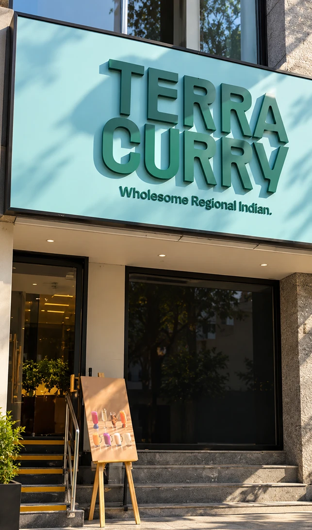
We proposed a teal-on-white blade sign and a deep teal hanging sign with cream lettering, both built around the bold stacked wordmark. The built signage keeps that clarity and adapts it to the building: a mint fascia with dimensional teal letters and the line “Wholesome Regional Indian.”, plus a circular blade sign carrying the TerraBowl monogram. The mint and teal stand out against the greenery and stone of GK-II while keeping the brand’s calm, earthy character.
We proposed a teal-on-white blade sign and a deep teal hanging sign with cream lettering, both built around the bold stacked wordmark. The built signage keeps that clarity and adapts it to the building: a mint fascia with dimensional teal letters and the line “Wholesome Regional Indian.”, plus a circular blade sign carrying the TerraBowl monogram. The mint and teal stand out against the greenery and stone of GK-II while keeping the brand’s calm, earthy character.


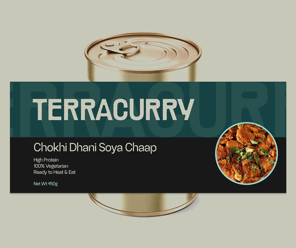
This packaging direction shows how TerraCurry could extend beyond the restaurant into ready-to-heat meals. Dark, near-black packs and cans carry the bold stacked wordmark in cream, with a deep teal band and an enlarged, cropped wordmark pattern behind it. A soft mint panel holds the dish photograph, framed in a circle on the cans and in a clean panel on the boxes.
This packaging direction shows how TerraCurry could extend beyond the restaurant into ready-to-heat meals. Dark, near-black packs and cans carry the bold stacked wordmark in cream, with a deep teal band and an enlarged, cropped wordmark pattern behind it. A soft mint panel holds the dish photograph, framed in a circle on the cans and in a clean panel on the boxes.


The TerraCurry Instagram feels as considered as the restaurant. The profile is clear from the first look: a confident bio, “Wholesome Regional Indian. The future of Indian dining.”, and tidy Highlights for Menu, Terra Bowl, Stores, Kitchen and Reviews. The posts hold together as one system. The teal and mint palette, the bold wordmark, playful italic headlines like “Take a sip!” and “New Age Indian!”, and food photography that makes you hungry all carry the brand’s earthy but futuristic personality. It’s clear the team behind the page cares about every detail, and it shows in a feed that’s warm, consistent and fun to scroll.
The TerraCurry Instagram feels as considered as the restaurant. The profile is clear from the first look: a confident bio, “Wholesome Regional Indian. The future of Indian dining.”, and tidy Highlights for Menu, Terra Bowl, Stores, Kitchen and Reviews. The posts hold together as one system. The teal and mint palette, the bold wordmark, playful italic headlines like “Take a sip!” and “New Age Indian!”, and food photography that makes you hungry all carry the brand’s earthy but futuristic personality. It’s clear the team behind the page cares about every detail, and it shows in a feed that’s warm, consistent and fun to scroll.
TerraCurry’s identity was created from the ground up. The core idea is that Terra means Earth: Indian comfort food rooted in the country’s varied terrains and expressed through a fresh, futuristic look. The system includes a TerraBowl-inspired monogram, a rounded wordmark, Random Grotesque typography, a palette of deep teal and soft mint with a fluorescent accent, and a typographic pattern with a gradient system. It shows up across the restaurant: the storefront signage, bottle labels, coasters, table cards and staff apparel, and it extends to a packaging direction for future ready-to-heat products.
The website carries the same thinking into a digital experience that is playful and easy to use. Visitors can drag and throw the letters in the headline, browse the seven regional TerraBowls, and spin when they can’t decide. Menu, offers, hours, directions and booking are always easy to reach. Between the brand’s storytelling and its practical information, the site never gets in the way of the food.
Our work didn’t stop at launch. We continue to support TerraCurry’s digital presence, including the Instagram profile and its posts, so that every post, Highlight and animation looks like part of the same brand. The goal is a brand that feels consistent and well looked after, from the street sign to the screen.
Brand Strategy, Narrative, Creative Direction
Abhishek
Abhishek
Brand Identity,
Visual Identity,
Packaging Design,
Collaterals Design
Sidharth
Sidharth
Web Direction,
Web Design,
Digital Menu Design
Sreerag
Sreerag
Say hi,
hello@slsh.studioLeave with a mark
Slash across the folded sheet. Every cut repeats eight times when it opens.
slsh.studio